

An effective homepage does one thing above everything else: it tells a visitor exactly what you do and gives them one clear next step, all within a few seconds of landing. That’s the whole job. Every pattern, every layout choice, every line of copy either supports that goal or works against it.
Before you study any specific site, here are the layout patterns worth scanning for immediately:
- Hero-led: Full-width headline and CTA above the fold, minimal distraction
- Search-as-hero: The search bar is the primary action (think marketplaces and travel)
- Split-screen: Two equal panels, often product vs. lifestyle or two audience paths
- Card grid: Browsable content blocks, common in marketplaces and media
- Storytelling/long-form: Opinionated scroll that filters for the right visitor
- Portfolio/motion-driven: Visual work front and centre, subtle animation as proof
The best homepage examples share a common trait: nobody notices the design because it gets out of the way. Visitors find what they came for, take the next step, and move on. That invisibility is the goal.
Table of Contents
- What makes a homepage design actually effective?
- How these examples were chosen
- 12 examples of effective homepage design and what to copy from each
- Which homepage layout pattern fits your site?
- How to adapt a homepage example for your Australian business
- How CantyDigital applies these patterns in practice
- Key takeaways
- The pattern that actually matters most
- CantyDigital builds homepages that convert, not just impress
- Sources and further reading
What makes a homepage design actually effective?
Good homepage design is not about looking impressive. It’s about removing every reason a visitor might leave before taking one action. These are the principles that separate high-converting homepages from attractive ones that don’t perform.
-
Hero clarity above the fold. If your headline can’t explain the core value in roughly seven words, it’s doing too much. B2B and SaaS homepages that fail the clarity test lose visitors before the page even finishes loading. Write the headline as an elevator pitch in the doorway, not a tagline.
-
One primary CTA. Multiple competing calls to action cause choice paralysis. Baymard research consistently shows that homepages built around a single dominant next step convert better than those offering three or four options at once. Pick one. Make it obvious.
-
Visible trust signals. Awards, client logos, review counts, and local proof (for Australian businesses, this means Australian client names and recognisable local references) close the credibility gap fast. Place them within the first scroll, not buried in the footer.
-
Clear audience targeting. A visitor should know within seconds whether the site is for them. Vague positioning (“solutions for businesses”) wastes the hero. Specific positioning (“project management for construction teams”) qualifies visitors immediately.
-
Fast performance. Motion, large hero images, and video backgrounds need careful compression and lazy-loading. Performance and interactivity must be balanced against load-speed budgets, especially on mobile.
-
Accessible navigation. Keyboard navigability, skip links, and screen-reader-compatible labels are not optional extras. The WebAIM Million report documents how widespread accessibility failures are across the web. Getting this right is a competitive advantage, not just a compliance checkbox.
-
Responsive mobile collapse. Australian sites see a high share of mobile traffic. A desktop-first layout that collapses poorly on a phone breaks hierarchy, hides CTAs, and misrepresents product scope. Design mobile-first, then scale up.
-
Value proposition band. A row of three or four short benefit points or icons placed directly under the hero helps B2B and SaaS visitors understand why they should act. This structural layer improves comprehension and reduces bounce on pages where the hero alone isn’t enough context.
-
Avoid carousels unless they’re essential. Baymard testing shows carousels frequently underperform. Most visitors never advance past the first slide. A static hero with a strong headline almost always outperforms a rotating one.
Pro Tip: Short hero or long opinionated page? Choose a short, punchy hero when your product is transactional and the visitor already knows the category (SaaS tools, booking platforms). Go long and opinionated when you’re selling a philosophy, a process, or a service that requires trust before a visitor will act. Trying to do both at once usually produces neither.
How these examples were chosen
Every homepage in this list was selected against a consistent set of criteria. Knowing the criteria also gives you a checklist to evaluate any homepage you come across.
Selection criteria used:
- Clarity of value proposition: Can a first-time visitor state what the site does in one sentence after five seconds?
- Single clear hero action: Is there one dominant CTA, or does the page ask visitors to do three things at once?
- Observable conversion signals: Are trust elements (social proof, client logos, review counts) visible without scrolling?
- Mobile behaviour: Does the layout collapse cleanly to a single-column mobile flow, or does it break hierarchy?
- Performance indicators: Does the page load quickly, or do heavy assets create a delay that kills engagement?
- Accessibility considerations: Are navigation elements keyboard-accessible? Are images labelled for screen readers?
- Localisation cues: For Australian audiences, does the site use local language, local proof, and local references where relevant?
Quick checklist to apply to any homepage:
- [ ] Can you state the site’s purpose in one sentence after five seconds?
- [ ] Is there exactly one primary CTA above the fold?
- [ ] Are trust signals visible in the first scroll?
- [ ] Does the mobile version preserve the same hierarchy as desktop?
- [ ] Does the page load without a noticeable delay on a mobile connection?
- [ ] Are interactive elements accessible by keyboard?
- [ ] Does the copy feel written for the specific audience, not a generic one?
The examples below span SaaS, direct-to-consumer, marketplaces, hospitality, and creative portfolios. That category balance is intentional: the patterns transfer across industries, but the adaptation steps differ.
12 examples of effective homepage design and what to copy from each
The table below gives a fast reference across all twelve examples. Detailed takeaways follow for each one.
| Brand | Pattern | Primary CTA | Why it works | Best for adapting |
|---|---|---|---|---|
| Slack | Hero-led | “Try for free” | Benefit-first headline, social proof band | SaaS, B2B tools |
| Dropbox | Hero-led | “Sign up for free” | Ultra-minimal copy, one action | Any product with a clear benefit |
| Airbnb | Search-as-hero | Search bar | The action is the product | Marketplaces, booking platforms |
| Uber | Split-screen | “Sign up to drive” / “Order now” | Dual audience, clean separation | Two-sided platforms |
| Canva | Hero-led + product preview | “Start designing” | Instant product preview, low friction | Creative tools, SaaS |
| Starbucks | Card grid | “Order now” | Visual product browsing, loyalty CTA | Food, retail, loyalty programmes |
| Fiverr | Search-as-hero | Search bar | Category trust signals, social proof | Service marketplaces |
| Four Seasons | Storytelling/immersive | “Explore” | Aspirational imagery, minimal copy | Luxury, hospitality, travel |
| Basecamp | Storytelling/long-form | “Try Basecamp” | Opinionated copy filters good-fit visitors | B2B, philosophy-led products |
| Squarespace | Split-screen | “Get started” | Template previews, clear audience | Website builders, creative tools |
| Notion | Hero-led | “Get Notion free” | Flexible positioning, product screenshot | Productivity, SaaS |
| Mailchimp | Storytelling/long-form | “Sign up free” | Personality-driven copy, clear benefit | Email tools, SMB marketing |
1. Slack: the benefit-first hero
Slack’s homepage leads with a headline that names the outcome (“Make work life simpler, more pleasant and more productive”) rather than the product’s features. Below the hero sits a row of recognisable client logos, which closes the trust gap before a visitor has scrolled at all. The single “Try for free” CTA removes the friction of a pricing decision.

What to copy: Write your headline as the outcome your customer gets, not what your product does. Place client logos or recognisable trust signals immediately under the hero, not in the footer.
Australian adaptation: Swap international logos for Australian brand names your local audience will recognise. “Trusted by [Australian company]” lands harder than a Fortune 500 name most local visitors have never worked with.
2. Dropbox: minimal copy, maximum clarity
Dropbox’s most famous headline, “Your stuff, anywhere,” is a textbook example of hero copy that removes jargon and explains the core benefit in three words. The page is almost entirely white space. One action. One message. Nothing competes for attention.
What to copy: Strip your hero copy down until it can’t be simplified further. If your headline needs a sub-headline to make sense, the headline isn’t working hard enough.
Australian adaptation: Australian audiences respond to directness. Avoid corporate-speak in your hero. Plain language outperforms polished marketing copy almost every time.
3. Airbnb: when the search bar is the homepage
Airbnb’s homepage is the search bar. The product and the CTA are the same thing. There’s no separate “get started” button because the act of searching is getting started. This pattern works because Airbnb’s visitors arrive with a specific intent: they want to find somewhere to stay.

What to copy: If your product is a search or discovery tool, make the search bar the hero. Don’t add a separate CTA that competes with the action your visitor already wants to take.
Australian adaptation: Pre-populate the search with Australian destinations or local categories to reduce friction and signal local relevance immediately.
4. Uber: splitting a two-sided audience cleanly
Uber’s homepage uses a split-screen pattern to address two completely different audiences (riders and drivers) without making either feel like an afterthought. Each panel has its own headline, its own CTA, and its own visual. The split is clean enough that a visitor knows instantly which side is theirs.
What to copy: If your business genuinely serves two distinct audiences, a split-screen hero is cleaner than trying to write one headline that covers both. Don’t force a single message onto a two-sided product.
Australian adaptation: Localise the imagery for each panel. Australian urban and regional contexts look different from US stock photography, and visitors notice.
5. Canva: show the product before the pitch
Canva’s homepage shows the product in action before explaining what it is. A live preview of the design tool sits inside the hero, which does two things: it answers “what does this do?” visually, and it lowers the perceived barrier to starting. The CTA (“Start designing”) is a natural next step from what the visitor just saw.
What to copy: If your product has a visual interface, show it in the hero rather than describing it. A screenshot or animated preview converts better than a paragraph of feature copy. For ecommerce website design, this principle applies equally to product photography.
Australian adaptation: Use Australian-made template examples or local design contexts in the preview to make the product feel immediately relevant.
6. Starbucks: card grid for a browsable product range
Starbucks uses a card grid below a relatively simple hero to let visitors browse seasonal drinks and food items. The grid pattern works here because the product range is visual and the visitor’s intent is often exploratory rather than directed. The loyalty programme CTA sits alongside the product grid, not above it.
What to copy: Use a card grid when your product range is visual and visitors benefit from browsing. Don’t force a grid onto a service business where the “products” are abstract.
Australian adaptation: Seasonal content should reflect Australian seasons, not Northern Hemisphere ones. A “winter warmers” campaign in July lands; the same campaign in January does not.
7. Fiverr: search-as-hero with category trust signals
Like Airbnb, Fiverr leads with a search bar. But Fiverr adds a row of popular service categories directly below the search, which helps visitors who don’t yet know exactly what they’re looking for. Social proof (number of services, client reviews) appears in the hero band, not buried further down.
What to copy: If your marketplace has broad categories, show them near the search bar. Visitors who don’t have a specific query will use the categories as a starting point. Trust signals in the hero band reduce hesitation before a visitor has committed to a search.
Australian adaptation: Surface Australian-specific service categories or local freelancers prominently to signal local relevance to Australian visitors.
8. Four Seasons: immersive storytelling for luxury
Four Seasons uses full-bleed photography and minimal text to create an aspirational atmosphere before asking for any action. The homepage is less about information architecture and more about emotional priming. The CTA (“Explore”) is deliberately soft because the conversion goal is inspiration, not an immediate booking.
What to copy: When your product is aspirational and the purchase decision is long, use imagery to create desire before you ask for action. Don’t rush the CTA on a luxury or high-consideration product.
Australian adaptation: Australian luxury travel audiences respond to local landscapes and properties. International imagery on an Australian luxury site can feel generic and disconnected.
9. Basecamp: long-form storytelling that filters visitors
Basecamp’s homepage is long, opinionated, and deliberately polarising. It makes a strong argument for a specific way of working and invites visitors who agree to sign up. Visitors who disagree self-select out, which is the point. Storytelling homepages like this convert well when the brand sells a philosophy or process rather than a simple transactional product.
What to copy: If your service requires a mindset shift or a significant commitment from the client, a long opinionated homepage can pre-qualify leads better than a short hero. Write it as an argument, not a brochure.
Australian adaptation: Australian business audiences tend to be direct and sceptical of hype. Opinionated copy works, but it needs to be grounded in concrete outcomes, not abstract philosophy.
10. Squarespace: split-screen with template previews
Squarespace uses a split-screen layout to show a live template preview alongside a short headline and CTA. The preview does the selling; the copy just confirms the category. Visitors can see what they’ll get before they commit to anything.
What to copy: When your product produces a visual output (websites, designs, documents), show the output in the hero. A split-screen with a live preview on one side and a CTA on the other is a proven pattern for creative tools. Grid systems underpin the clean alignment that makes this layout feel polished.
Australian adaptation: Feature Australian-style templates or local business examples in the preview to make the product feel immediately relevant to local visitors.
11. Notion: flexible hero for a flexible product
Notion’s homepage is interesting because the product is genuinely hard to categorise. Their solution is a flexible hero that uses a short, broad headline (“The connected workspace where better, faster work happens”) and a product screenshot that shows multiple use cases at once. The CTA is free and frictionless.
What to copy: If your product serves multiple use cases, resist the temptation to list them all in the hero. Pick the broadest, most compelling benefit and let the product screenshot show the range.
Australian adaptation: Australian SMBs and startups are a strong fit for flexible productivity tools. Localise the screenshot to show Australian business contexts (local currency, Australian company names in the UI).
12. Mailchimp: personality-driven copy with a clear benefit
Mailchimp’s homepage has always used a distinctive visual style and personality-driven copy to stand out in a crowded category. The headline names a specific outcome for a specific audience (“Turn emails into revenue”), and the illustration style makes the brand immediately recognisable. The CTA is free and low-commitment.
What to copy: A strong visual identity in the hero can differentiate a product in a crowded market where every competitor uses the same stock photography. Pair personality with a specific, outcome-focused headline.
Australian adaptation: Mailchimp’s illustration style is distinctive enough to work globally, but for Australian SMBs, pairing personality with local social proof (Australian customer results) adds credibility.
Which homepage layout pattern fits your site?
Understanding the pattern behind each example helps you choose the right structure before you start designing. Here’s how the main patterns compare.
| Pattern | Best for | Clarity | Mobile complexity | Speed risk | Accessibility note |
|---|---|---|---|---|---|
| Hero-led | SaaS, B2B, services | High | Low | Low–medium | Skip link to main content required |
| Search-as-hero | Marketplaces, booking, directories | High | Medium | Low | Search input needs ARIA label |
| Split-screen | Two-audience products, creative tools | Medium–high | Medium | Low | Ensure column order is logical on mobile |
| Card grid | Retail, media, marketplaces | Medium | Medium–high | Medium | Cards need keyboard focus states |
| Storytelling/long-form | Philosophy-led, high-consideration B2B | Medium | High | Medium–high | Heading hierarchy critical for screen readers |
| Portfolio/motion-led | Creative agencies, studios | Low–medium | High | High | WCAG 2.1 requires pause/stop controls for motion |
Implementation tips by pattern:
- Hero-led: Keep the hero copy to one headline and one sub-line maximum. Add a value proposition band of three to four benefit points directly below. Use a single CTA button with high contrast.
- Search-as-hero: Place popular categories or suggested searches below the input to help visitors who arrive without a specific query. Ensure the search input has a clear ARIA label for screen readers.
- Split-screen: On mobile, decide which panel appears first and make sure it’s the one most visitors need. Don’t stack both panels at equal weight on a small screen.
- Card grid: Limit the number of cards visible above the fold to avoid overwhelming visitors. Use consistent card dimensions and clear hover states for keyboard users.
- Storytelling/long-form: Use a clear heading hierarchy (H1, H2, H3) so screen readers can navigate the page. Break the scroll into named sections with visible anchors.
- Portfolio/motion-led: WCAG 2.1 guidelines require that motion triggered by interaction can be disabled. Provide a reduced-motion alternative and test with
prefers-reduced-motionin CSS.
Mobile navigation failures are among the most common homepage UX problems. For Australian audiences, where mobile traffic dominates, a pattern that collapses poorly on a small screen isn’t just a design issue — it’s a conversion issue.
How to adapt a homepage example for your Australian business
Inspiration is only useful if you can act on it. Here’s a practical, ordered process for taking a pattern from the gallery above and applying it to your own site.
-
Audit your current hero messaging. Write down what your homepage currently says in the hero. Then ask someone unfamiliar with your business to read it and tell you what you do. If they can’t answer accurately in five seconds, the messaging needs work. Check your home page SEO at the same time — the headline that works for visitors usually works for search too.
-
Choose one primary CTA. Look at your current homepage and count the number of distinct calls to action above the fold. If there’s more than one, decide which action is most valuable to your business and remove or demote the others.
-
Adapt imagery and copy for a local audience. Replace international stock photography with Australian imagery. Use Australian spelling, local references, and Australian client names in testimonials. Local trust signals matter more to Australian visitors than global social proof.
-
Collapse the pattern for mobile. Open your chosen pattern on a phone. Check that the headline is still the first thing visible, the CTA is reachable without scrolling, and the navigation doesn’t obscure content. Single-column mobile flows preserve hierarchy better than compressed multi-column layouts.
-
Add trust signals in the first scroll. Place client logos, review counts, or awards within the first viewport on both desktop and mobile. Don’t make visitors scroll to find proof that you’re credible.
-
Run a performance budget check. Use Google Lighthouse to score your page before launch. Aim for a performance score above 90 on mobile. Compress hero images, lazy-load below-the-fold assets, and defer non-critical scripts. Motion and large imagery need careful handling to avoid killing load speed.
-
Launch A/B tests on the highest-impact elements. Start with the headline (outcome-focused vs. feature-focused), then test the CTA label (action verb vs. benefit phrase), then test hero image vs. product screenshot. Run one test at a time so results are readable.
A/B test ideas worth running:
- Headline A: feature-focused (“Project management software”) vs. Headline B: outcome-focused (“Finish projects on time, every time”)
- Single CTA (“Book a call”) vs. dual CTA (“Book a call” + “See our work”)
- Hero image (lifestyle/team) vs. product screenshot (interface preview)
- Short hero (above the fold only) vs. long opinionated page (full scroll)
KPIs to track after launch:
- Bounce rate in the first five seconds (a high rate signals hero clarity failure)
- Primary CTA click-through rate (the single most important conversion signal)
- Mobile conversion rate vs. desktop (a large gap signals mobile collapse problems)
- Lighthouse performance score on mobile (target above 90)
- Scroll depth (for storytelling/long-form pages, check whether visitors reach the CTA)
Pre-launch checklist:
- [ ] Lighthouse performance score above 90 on mobile
- [ ] All images compressed and labelled with descriptive alt text
- [ ] Skip-to-content link present for keyboard users
- [ ] Primary CTA visible without scrolling on a 375px screen
- [ ] Heading hierarchy correct (one H1, logical H2/H3 structure)
- [ ] All interactive elements reachable by keyboard
- [ ] Reduced-motion CSS alternative in place for any animation
- [ ] Australian spelling and local references confirmed throughout
For a deeper look at what kills conversions before a visitor even reaches the CTA, the web design elements that hurt conversions guide covers the most common pitfalls.
How CantyDigital applies these patterns in practice
CantyDigital has been building high-performance websites for Australian businesses for 12 years. The patterns described in this article aren’t theoretical for the team — they’re the working vocabulary of every project brief.
What the work looks like in practice:
-
A local service business in the Illawarra region came to CantyDigital with a homepage that listed eight services in the hero and had no clear primary CTA. The team rebuilt the page around a single hero-led pattern: one outcome-focused headline, one CTA, and a value proposition band of four benefit points below the fold. The mobile layout was rebuilt as a single-column flow with the CTA pinned above the scroll.
-
A B2B client with a complex service offering needed a homepage that pre-qualified visitors rather than trying to appeal to everyone. CantyDigital applied a storytelling/long-form pattern with a clear heading hierarchy, opinionated copy, and a single CTA at the end of each scroll section. The result was a page that filtered for serious enquiries rather than generating high volumes of unqualified leads.
-
For an ecommerce client, the team used a card grid pattern below a clean hero, with Australian product photography and local trust signals (Australian reviews, local shipping information) in the first scroll. The mobile version was designed first, then scaled to desktop.
As a trusted 5-star Wix Partner, CantyDigital brings both creative design and technical SEO into every homepage build. The design portfolio shows the patterns in action across a range of Australian industries. If you’ve identified a pattern from this article that fits your business, the portfolio is the fastest way to see how it translates to a finished site.
Key takeaways
Effective homepages share one non-negotiable quality: they make the visitor’s next step obvious within seconds, with no competing distractions and no ambiguity about who the site is for.
| Point | Details |
|---|---|
| Hero clarity is non-negotiable | Your headline must communicate the core benefit in roughly seven words or fewer. |
| One CTA converts better than many | Multiple competing calls to action cause choice paralysis; pick one dominant next step. |
| Mobile-first collapse is critical | Australian mobile traffic is high; design single-column mobile flows before scaling to desktop. |
| Local trust signals matter | Australian audiences respond to Australian client names, local awards, and AU-specific references. |
| CantyDigital builds to these standards | As a 5-star Wix Partner with 12 years’ experience, CantyDigital applies these patterns across Australian homepage builds. |
The pattern that actually matters most
There’s a tendency in design discussions to treat homepage layout as the primary variable. Pick the right pattern, the thinking goes, and the results follow. In practice, the pattern is almost never the deciding factor.
The homepages that actually convert well share something more fundamental: they’re written and designed for a specific person with a specific intent. Slack’s homepage works not because it uses a hero-led layout, but because the headline names an outcome that a specific kind of worker genuinely wants. Airbnb’s search-as-hero works not because search bars are inherently effective, but because Airbnb’s visitors arrive with a specific task in mind and the homepage removes every step between arrival and that task.
Australian businesses often get this backwards. They choose a layout that looks impressive, then try to fit their messaging into it. The result is a homepage that looks polished but doesn’t convert, because the layout was chosen before the visitor’s intent was understood.
The practical implication: before you choose a pattern, write the one sentence that describes what your ideal visitor wants to do when they land on your homepage. Then choose the pattern that makes that action the most obvious thing on the page. The visual design follows from that decision, not the other way around.
For Australian businesses specifically, the mobile-first constraint is worth treating as a creative brief rather than a technical afterthought. Designing for a 375px screen first forces the kind of ruthless prioritisation that makes homepages work. If the CTA isn’t visible on a phone without scrolling, it probably isn’t prominent enough on desktop either.
CantyDigital builds homepages that convert, not just impress
If this article has helped you identify the pattern your homepage needs, the next step is straightforward. CantyDigital builds high-performance websites for Australian businesses from the ground up, with every homepage designed around a single clear conversion goal and built to perform on mobile from day one.
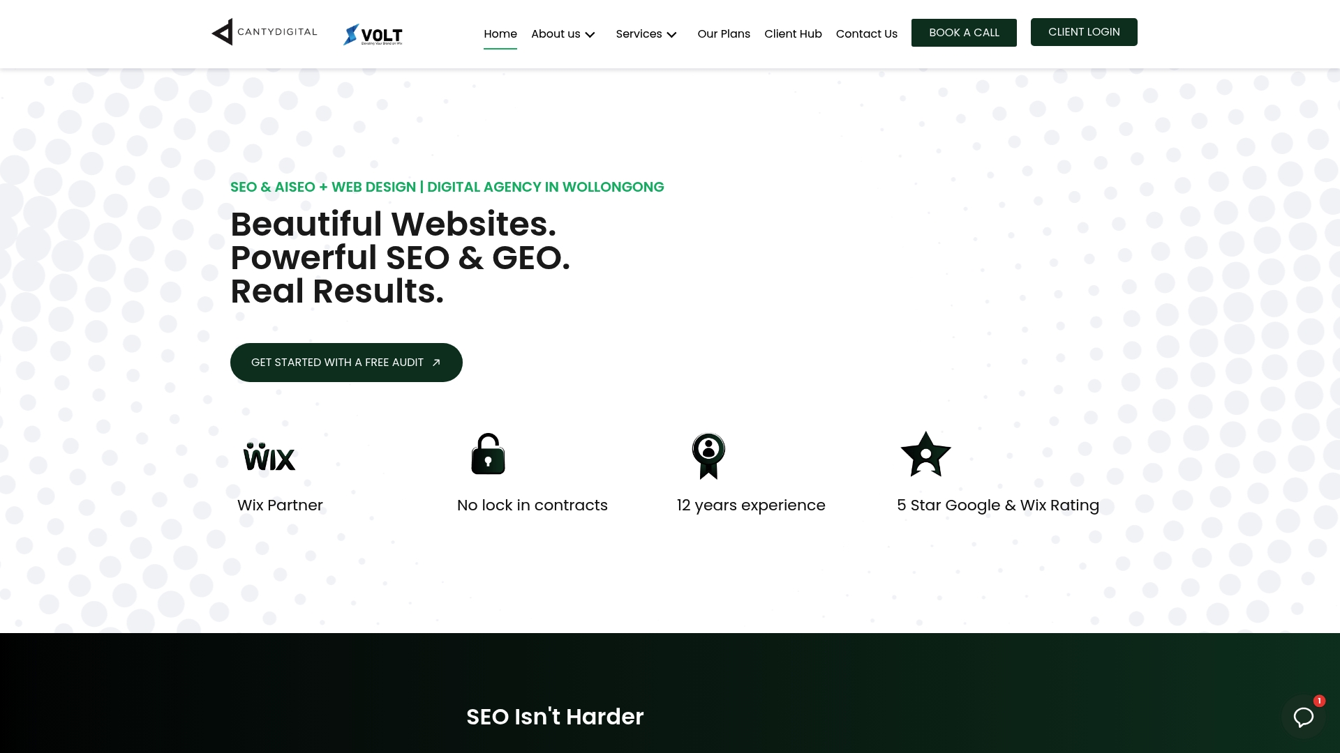
Every homepage build includes hero messaging review, mobile-first layout design, performance optimisation, and AI SEO compatibility so your site ranks on both traditional search engines and AI-driven platforms. No lock-in contracts. No vague deliverables. Just a homepage that does the job it’s supposed to do.
If you’re not sure where to start, the website design FAQs page covers the most common questions about the process, timelines, and what to expect from a homepage redesign. Ready to talk through your specific situation? Get in touch with the team for a no-obligation discovery conversation.
Sources and further reading
The following sources were used to build and verify the claims in this article. Each is worth reading for deeper context on the principles covered.
-
Baymard Institute: Homepage & category usability — The most rigorous independent research on homepage UX, covering mobile navigation failures, carousel performance, and single-CTA conversion principles. Referenced throughout for mobile and conversion claims.
-
Wegic: 9 best website homepage examples — Practical breakdowns of homepage anatomy including the value proposition band structure and storytelling pattern guidance. Used for B2B/SaaS principles and long-form homepage rationale.
-
HubSpot Designers Blog: 15 examples of brilliant homepage design — Design-focused analysis of hero copy, performance trade-offs, and motion/imagery balance. Referenced for Dropbox hero copy analysis and performance optimisation guidance.
-
UXPilot: 16 homepage design examples — UX practitioner perspective on functional layouts and the principle that the best homepages are the ones users don’t notice. Used for the core “design serves intent” claim.
-
Squarespace: Website layout ideas and best practices — Practical guide to layout patterns (single column, grid, split-screen, hero section) with visual hierarchy and whitespace principles. Background reference for the patterns library section.
-
WebAIM Million report — Annual accessibility audit of the top one million websites. Referenced for the accessibility principle in core homepage design.
-
W3C WCAG 2.1: Pause, stop, hide — The governing standard for motion controls on web pages. Referenced in the patterns library for portfolio/motion-led layouts.
-
W3C WCAG 2.1: Animation from interactions — Accessibility standard for interaction-triggered animation. Referenced for reduced-motion implementation guidance.