


A mobile-friendly business website is one that loads fast, displays correctly, and works intuitively on any smartphone or tablet. Building a mobile-friendly business website is no longer optional for small business owners. Mobile search has overtaken desktop, and over three-quarters of consumers leave sites that load slowly or display poorly on mobile. That single fact shapes every decision you make about design, content, and technology. The industry term for this approach is responsive web design, and it is the foundation of every high-performing business site built today.
What do you need before you build a mobile-friendly business website?
The right tools and a clear plan save you from rebuilding your site six months later. Before you write a single line of content or pick a colour scheme, get these three things sorted.
Know your business information cold. Your site needs your trading name, address, phone number, opening hours, services, and a short description of what you do. AI-driven website builders use this information to generate your first draft automatically. The more specific you are upfront, the less editing you do later.
Choose the right tool category. Three types of platforms dominate the market for small business owners:
- AI website builders: Describe your business in plain language and the platform generates a complete, mobile-responsive site. Build time drops from weeks to under an hour, with costs ranging from $0 to around $150 annually. This is the fastest path for owners with no technical background.
- Drag-and-drop editors: You pick a template and customise every element visually. More control, but more time. Good for owners who want a specific look and are willing to spend a few days on it.
- CMS platforms: Content management systems like WordPress give you full flexibility and deep SEO control. They require more technical knowledge and ongoing maintenance.
| Tool type | Ease of use | Mobile responsiveness | Typical cost |
|---|---|---|---|
| AI builder | Very easy | Automatic | $0–$150/year |
| Drag-and-drop editor | Moderate | Template-dependent | $15–$50/month |
| CMS platform | Technical | Manual setup required | $10–$100+/month |
For most small business owners, an AI builder or a quality drag-and-drop editor is the right starting point. You can always migrate to a more complex platform as your business grows.
Pro Tip: Before choosing a platform, check whether it offers a dedicated mobile preview mode. The ability to toggle between desktop, tablet, and mobile views before publishing is a non-negotiable feature.
How do you build a mobile-responsive site step by step?
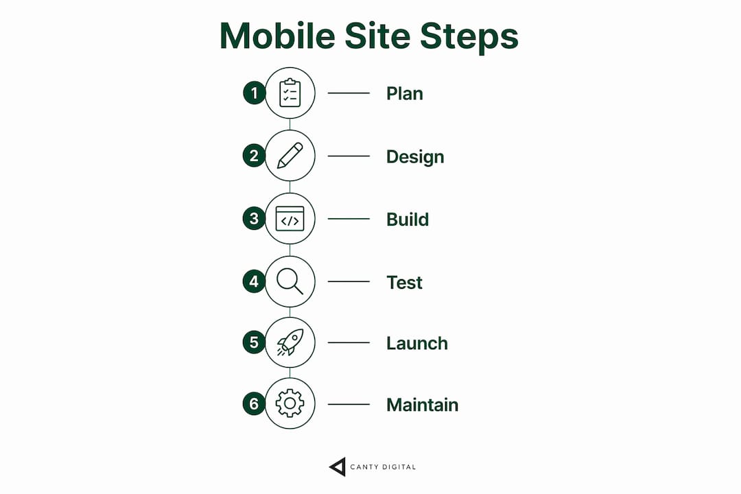
The process is more straightforward than most small business owners expect. Follow these steps and you will have a live, mobile-optimised site without needing a developer.
Describe your business clearly. Open your chosen AI builder and enter your business name, category, location, and a two-sentence description of what you offer. The more specific you are, the better the generated layout will match your needs.
Review and customise the generated layout. The AI produces a full site with pages, sections, and placeholder content. Swap in your real text, photos, and brand colours. Keep your colour palette to two or three colours so the design stays clean on small screens.
Add the features your customers actually need. AI-built templates include contact forms, Google Maps integration, and SEO-optimised pages by default. Check that your phone number is clickable, your address links to Google Maps, and your contact form works on a phone screen.
Test every page in mobile preview mode. Website builders offer preview modes for desktop, tablet, and mobile. Use them. Check that text is readable without zooming, buttons are easy to tap, and images scale correctly.
Connect your domain and publish. Most platforms walk you through domain connection in under ten minutes. Once live, share the URL with a few people and ask them to browse it on their phones before you promote it widely.
Plan for iterative updates. Your site is not finished on launch day. You can add blogs, photo galleries, or online stores post-launch by describing the new feature to the AI builder. This means your site grows with your business without requiring a developer.
Pro Tip: The most common mistake at launch is forgetting to test the contact form on an actual phone. Send yourself a test submission from your mobile before you go live.
What are the best practices for mobile web design and usability?
A site that looks good on desktop but frustrates mobile users will cost you customers. These are the design and usability principles that separate high-performing mobile sites from average ones.

Prioritise page speed above everything
Over three-quarters of consumers leave sites that load slowly on mobile. Compress every image before uploading it. Use formats like WebP where your platform supports it. Avoid embedding large video files directly on your homepage. Speed is the single biggest factor in whether a mobile visitor stays or leaves.
Simplify your navigation
Effective mobile navigation requires no more than three taps to reach any key page. Use a hamburger menu (the three-line icon) to keep the header clean. Limit each menu category to one level of submenu. Put your most important pages, such as Services, Contact, and About, at the top of the menu list.
Design every button for a finger, not a cursor
Touch-friendly buttons need at least 44 pixels in both height and width. Buttons smaller than this cause tap errors and frustrate users. Space buttons apart so a user cannot accidentally tap two at once. This applies to navigation links, call-to-action buttons, and form submission buttons.
Tailor your homepage content for mobile intent
Mobile visitors behave differently from desktop visitors. They want your phone number, your address, or a quick answer to a specific question. Put your most important contact details above the fold on mobile. A “Call Now” button in the header converts far better than a buried contact page link.
Simplify your forms
Long forms kill mobile conversions. Ask for the minimum information you actually need. Use large input fields with clear labels. Enable autofill where possible. A three-field enquiry form (name, phone, message) will outperform a ten-field form every time on mobile.
Understanding responsive web design principles helps you make better decisions at every stage of this process, whether you are using an AI builder or working with a developer.
How do SEO and ongoing maintenance affect your mobile site?
A live site is the starting point, not the finish line. Search visibility and long-term performance depend on what you do after launch.
Submit to Google Search Console immediately. SEO built into website builders helps Google understand your pages, but it does not guarantee indexing. Submitting your sitemap to Google Search Console speeds up discovery and gives you data on how Google sees your site. It is free and takes about five minutes.
Use your builder’s built-in SEO tools properly. Fill in the page title and meta description for every page. Use your business name and location in headings where it reads naturally. Add descriptive alt text to every image. These steps are small individually but compound into meaningful ranking signals over time.
Monitor mobile usability in Google Search Console. The Mobile Usability report flags specific issues like text too small to read, clickable elements too close together, and content wider than the screen. Fix these as they appear. Google’s mobile-first indexing means it crawls and ranks your site based on the mobile version, not the desktop version.
Keep your content current. Update your services, pricing, and opening hours whenever they change. Stale information erodes trust and can hurt local search rankings. A mobile SEO strategy that includes regular content updates outperforms a set-and-forget approach every time.
| Maintenance task | Frequency | Why it matters |
|---|---|---|
| Check Google Search Console | Monthly | Catches indexing and usability errors early |
| Update business info | As needed | Keeps local search listings accurate |
| Compress new images | Every upload | Protects page speed |
| Review mobile usability report | Quarterly | Flags design issues before they affect rankings |
| Refresh page content | Every 3–6 months | Signals to Google that the site is active |
For small business owners who want to go deeper, local SEO is the natural next step after getting your mobile site right.
Key takeaways
A mobile-friendly business website built on responsive design principles, with fast load times, touch-friendly navigation, and regular SEO maintenance, gives small business owners their strongest foundation for online visibility.
| Point | Details |
|---|---|
| Mobile-first is non-negotiable | Google indexes the mobile version of your site first, so mobile quality directly affects rankings. |
| AI builders cut launch time dramatically | Build time drops from weeks to under an hour, with costs as low as $0 annually. |
| Touch targets must be large enough | Buttons need at least 44 pixels in height and width to prevent tap errors on mobile. |
| Three-tap navigation rule | Mobile users should reach any key page in three taps or fewer. |
| Submit to Google Search Console | Built-in SEO tools alone do not guarantee indexing; manual submission speeds up discovery. |
Why I think most small businesses get mobile wrong from the start
The most common mistake I see is treating mobile as an afterthought. A business owner builds a desktop site they love, then checks it on their phone and tries to “fix” the mobile version. That approach produces a compromised result every time. Mobile responsiveness is not a feature you add at the end. It is a design constraint you build around from the first decision.
The shift to AI builders has genuinely changed what is possible for small business owners. A few years ago, getting a properly responsive site meant hiring a developer or spending weeks learning a platform. Now, a business owner with no technical background can describe their business in plain language and have a mobile-optimised site live within an hour. That is a real change, not marketing copy.
What I find most business owners underestimate is the ongoing side of mobile performance. Getting the site live is straightforward. Keeping it fast, fixing the issues Google flags, and updating content regularly is where most sites fall behind. The owners who treat their website as a living part of their business, not a one-time project, consistently outperform those who do not.
My honest advice: start with a platform that handles mobile responsiveness automatically, get the site live quickly, and then invest your energy in the SEO and content work that compounds over time. Do not wait for a perfect site. A good mobile site published today beats a perfect site published in six months.
— Matthew
How CantyDigital helps small businesses get mobile right
Building a mobile-friendly site is one thing. Building one that ranks, converts, and grows with your business is another challenge entirely.
CantyDigital is a Wollongong-based digital agency with 12 years of experience building high-performance websites designed for mobile users from the ground up. Every site we build is optimised for speed, mobile usability, and search visibility, with SEO baked in from the first page. If you are weighing up your options, our website design FAQs cover the most common questions small business owners ask before starting. We offer flexible, no-lock-in arrangements so you can get professional results without a long-term commitment.
FAQ
What is a mobile-friendly business website?
A mobile-friendly business website adapts its layout, text size, and navigation to display correctly on smartphones and tablets. The industry standard approach is responsive web design, where a single site adjusts automatically to any screen size.
How long does it take to build a mobile-responsive site?
AI-driven website builders reduce build time from the traditional 4–8 weeks to as little as 30–60 minutes for small business owners with no technical background.
Does Google rank mobile sites differently?
Google uses mobile-first indexing, meaning it crawls and ranks your site based on the mobile version. A site that performs poorly on mobile will rank lower, regardless of how well it performs on desktop.
What size should buttons be on a mobile website?
Touch-friendly buttons need at least 44 pixels in both height and width. Smaller buttons cause tap errors and reduce usability on mobile devices.
Do I need to submit my site to Google after launch?
Built-in SEO tools in website builders help Google understand your pages but do not guarantee indexing. Submitting your sitemap to Google Search Console after launch speeds up discovery and gives you access to mobile usability data.


