


A high-converting landing page is a focused, standalone web page built to turn visitors into leads or customers by directing every element toward a single conversion goal. The average landing page converts at 6.6% across industries, while top performers consistently hit 20% or higher. That gap is not luck. It is the result of deliberate design decisions applied at every level of the page. This guide walks marketers and business owners through the exact principles, steps, and pitfalls that separate pages that convert from pages that simply exist.
What are the essential elements of a high-converting landing page?
Every effective landing page shares a common structure. The elements below are not optional extras. They are the foundation.
- A headline that matches visitor intent. Visitors decide whether your page is relevant within 5 seconds. Clarity outperforms cleverness every time. Your headline must state the primary benefit immediately, using the same language your visitor used to find you.
- A supporting subheadline. The subheadline adds specificity. It answers the question the headline raised and gives visitors one more reason to keep reading.
- A single, high-contrast call to action (CTA). One CTA. Not two, not three. The button copy must start with an action verb and name the outcome: “Get my free quote” beats “Submit” every time.
- Trust signals placed near the CTA. Star ratings, client logos, security badges, and short testimonials placed directly beside or below the CTA reduce hesitation at the exact moment visitors are deciding.
- Above-the-fold content that sells without scrolling. The headline, subheadline, CTA, and at least one trust signal must all appear before the visitor scrolls. Many visitors never scroll at all.
- Real visuals, not stock photos. Outcome-oriented visuals such as product screenshots, real demos, and genuine customer photos build far more trust than generic imagery of people smiling at laptops.
Pro Tip: Run your headline past someone unfamiliar with your product. If they cannot tell you what the page offers within five seconds, rewrite it.
The structure above applies whether you are building a lead generation page, a product sales page, or a webinar registration page. The principle is the same: every element earns its place by supporting the single conversion goal.
How to plan before you build an effective landing page
Execution without planning produces pages that look good but do not convert. Before you open a design tool, answer these four questions.
- Who is this page for? Define your visitor’s intent precisely. A visitor clicking a Google Ad for “affordable accountant Wollongong” has a very different mindset from someone who found your page through an organic blog post. The page must speak to one specific visitor type.
- What is the single conversion goal? Choose one action: book a call, download a guide, or start a free trial. Pages with multiple goals dilute attention and reduce completions. A dedicated landing page for each campaign converts 3 to 5 times better than sending traffic to a homepage.
- Which platform will you build on? Your choice of platform affects design flexibility, page speed, and integration options. Match the platform to your technical capability and campaign volume. For businesses wanting pages built with SEO and performance baked in from the start, working with a specialist agency is often faster than learning a new tool under campaign pressure.
- How will you measure success? Set up conversion tracking before launch. Google Analytics 4, Google Tag Manager, and Meta Pixel are the standard tools. Without tracking, you cannot improve what you cannot measure.
The table below summarises the planning checklist before any design work begins.
| Planning step | What to confirm |
|---|---|
| Audience and intent | One visitor type, one search intent |
| Conversion goal | Single action defined and measurable |
| Platform choice | Matches technical skill and campaign needs |
| Tracking setup | Conversion events firing before launch |
| Message match | Headline mirrors the ad or link that sent the visitor |
Pro Tip: Check that your landing page headline uses the same core phrase as your ad headline. Message match alone can lift conversions significantly before you change anything else on the page.
Step-by-step: how to design a high-converting landing page
With planning done, execution follows a clear sequence. Work through these steps in order.
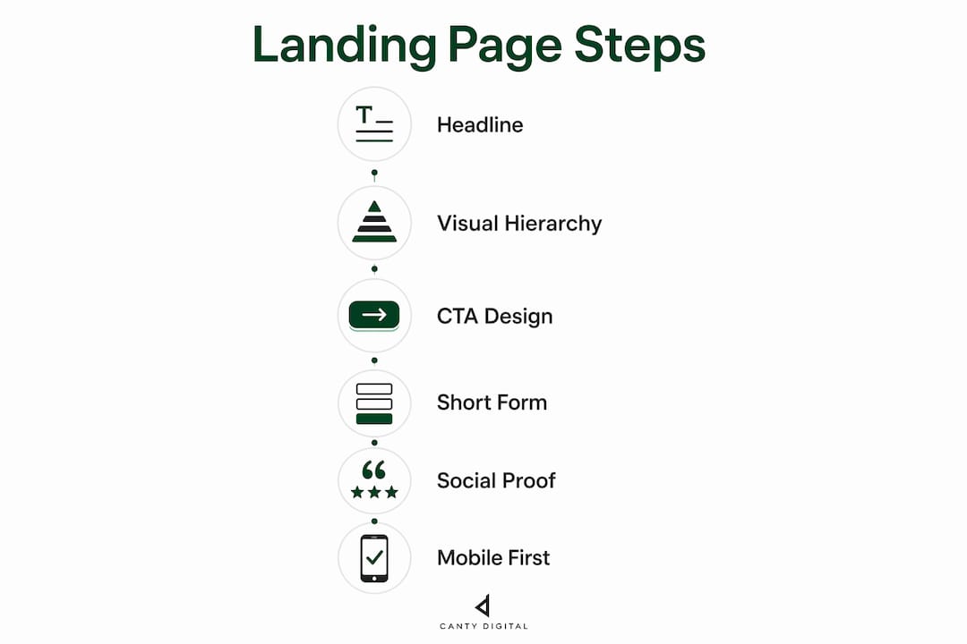
1. Write the headline first
Start with the headline, not the design. A benefit-led headline written before any visual work keeps the entire page focused. Improving headline alignment with ad intent can increase conversion rates by 250% to 300%. That is the single highest-leverage change available to most marketers.
2. Apply visual hierarchy to guide attention
Visual hierarchy is the technique of using size, contrast, and colour to direct visitor attention toward the CTA. The headline is the largest element. The CTA button is the highest-contrast element. Supporting text is smaller and lower in visual weight. This sequence tells the visitor’s eye exactly where to go without requiring conscious effort.

3. Design the CTA button with intention
The CTA button needs three things: colour contrast against the background, action-first copy, and placement above the fold. Repeat the CTA at least once lower on the page for visitors who scroll through the full content before deciding. Avoid grey or low-contrast buttons. They disappear visually and reduce clicks.
4. Shorten your form
Form length is one of the most direct levers on conversion rate. Each additional field beyond three reduces completions by approximately 14%. Ask only for what you genuinely need at this stage of the relationship. Name and email is enough for most lead generation pages. You can collect more information after the initial conversion.
5. Place social proof strategically
Generic praise does not convert. Named testimonials with a photo, a job title, and a specific outcome perform significantly better than anonymous five-star ratings. Specific and named testimonials outperform vague praise consistently. Place the strongest testimonial directly below or beside the primary CTA, where hesitation is highest.
6. Build for mobile first
Mobile visitors are not a secondary audience. Design the page for a small screen first, then scale up. CTAs placed within thumb zones (the bottom two-thirds of the screen) increase taps by 15–25%. Keep buttons large enough to tap without zooming. Compress images and use modern formats to hit load times under 2 seconds. Pages loading under 2 seconds convert at twice the rate of those taking 5 seconds or more.
The table below maps each execution step to its primary conversion impact.
| Design step | Primary conversion impact |
|---|---|
| Benefit-led headline | Immediate relevance signal to visitor |
| Visual hierarchy | Guides eye to CTA without friction |
| High-contrast CTA button | Increases click visibility and action rate |
| Form with 3 or fewer fields | Reduces abandonment at the conversion point |
| Named testimonials near CTA | Reduces hesitation at the decision moment |
| Mobile thumb-zone CTA placement | Increases taps by 15–25% on small screens |
What mistakes kill landing page conversions?
Knowing what to build is only half the picture. These are the errors that undo good design work.
- Multiple CTAs or navigation links. Removing navigation from a landing page raises conversions by up to 266%. Every link that leads away from the page is an exit. Keep only internal anchor links within the page itself.
- Headlines that do not match the ad. If your Google Ad says “Free website audit” and your landing page headline says “Digital marketing solutions,” visitors feel misled. They leave. Message mismatch is one of the most common and most costly errors. You can read more about design errors that hurt conversions on the CantyDigital blog.
- Forms with too many fields. Asking for a phone number, company size, budget range, and industry on a first-touch page is a conversion killer. Cut every field that is not strictly necessary.
- Stock imagery of generic people. A photo of a smiling stranger in a suit adds nothing. A screenshot of your actual product dashboard or a photo of a real customer builds credibility.
- Slow page load times. A page that takes more than 5 seconds to load on mobile loses a large portion of its audience before they see a single word. Page speed is a design decision, not just a technical one.
- Ignoring mobile usability. Tiny text, buttons that require pinching to tap, and forms that do not auto-fill on mobile all create friction that kills conversions on smaller screens.
“The best landing page is the one that removes every possible reason for a visitor to leave before completing the single action you want them to take. Every element either supports that goal or undermines it. There is no neutral.”
Common website redesign mistakes often mirror landing page errors. If your broader site has these problems, your landing pages likely do too.
Key takeaways
A high-converting landing page succeeds by combining a clear single goal, message-matched headlines, a high-contrast CTA, short forms, and mobile-first design to consistently outperform the 6.6% industry average.
| Point | Details |
|---|---|
| Single conversion goal | Focused pages convert 3–5 times better than homepages for campaign traffic. |
| Headline message match | Aligning headlines with ad intent can lift conversions by up to 300%. |
| Short forms convert better | Each form field beyond three reduces completions by approximately 14%. |
| Mobile-first CTA placement | Thumb-zone CTAs increase taps by 15–25% on mobile devices. |
| Remove navigation links | Eliminating exit links raises conversions by up to 266%. |
What I have learned after years of landing page work
The biggest mistake I see marketers make is treating a landing page like a miniature website. They add navigation menus, multiple CTAs, a blog link, and a footer full of links. Then they wonder why the page does not convert.
The discipline of a landing page is the discipline of subtraction. Every element you remove that does not directly support the conversion goal is a win. That is genuinely hard for business owners who have invested in their brand story and want to tell all of it. My advice is always the same: tell that story on your website. Save the landing page for the one thing you want the visitor to do right now.
The other thing I have learned is that testing cannot wait until you think the page is “ready.” Launch with your best hypothesis, then test headline variants and CTA copy within the first two weeks. The data from real visitors will tell you more than any amount of pre-launch deliberation. Clients who commit to continuous testing consistently outperform those who treat the page as a finished product.
Finally, do not separate your landing page data from your broader marketing analytics. The page is one step in a longer journey. If you know which traffic sources produce the highest-quality leads from your landing page, you can shift budget accordingly. That integration between page performance and campaign strategy is where the real gains live.
— Matthew
How CantyDigital builds landing pages that convert
CantyDigital has spent 12 years building high-performance websites and landing pages for Australian businesses. Every page is built from the ground up with conversion focus, mobile-first design, and SEO compatibility built in, not bolted on afterwards.
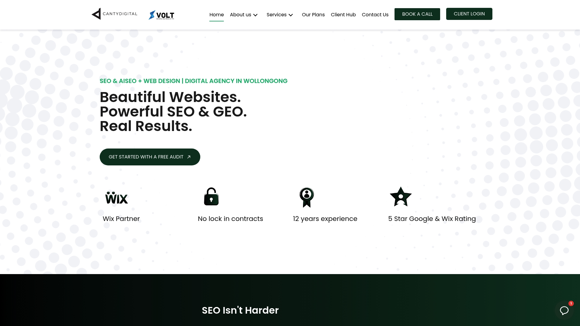
If you are ready to stop sending paid traffic to pages that underperform, CantyDigital offers tailored web design solutions with no lock-in contracts. Browse the website design FAQs to understand exactly what is included, or get in touch for a bespoke quote matched to your campaign goals. As a 5-star Wix Partner based in Wollongong, CantyDigital delivers measurable results for businesses across Australia.
FAQ
What is a good landing page conversion rate?
The industry average is 6.6%, but top-performing pages consistently achieve 20% or higher. Anything above 10% is considered strong for most industries.
How many CTAs should a landing page have?
A landing page should have one primary CTA. Multiple CTAs split visitor attention and reduce the overall conversion rate.
How long should a landing page form be?
Keep forms to three fields or fewer. Each additional field beyond three reduces form completions by approximately 14%.
Does page speed affect landing page conversions?
Yes. Pages that load in under 2 seconds convert at twice the rate of pages taking 5 seconds or more. Page speed is a direct conversion factor, not just a technical metric.
Should I send ad traffic to my homepage?
No. A dedicated landing page converts 3 to 5 times better than a homepage for campaign traffic, because it maintains message match and removes distractions.