


Grid systems in web design are defined as structured frameworks of columns, rows, and spacing that organise content into consistent, predictable layouts. The role of grid systems in web design goes far beyond aesthetics. Grids reduce cognitive load, speed up development, and make responsive design far easier to manage across screen sizes. Industry standards like the 12-column grid and the 8pt spacing system have become the baseline for professional web projects in 2026. A well-defined grid removes layout guesswork, letting designers focus on hierarchy and content rather than pixel-pushing decisions.
How do grid systems improve user experience and design consistency?
Grids directly improve how users process and navigate information. When layout patterns are predictable, users spend less mental energy figuring out where things are and more time engaging with the content itself.
The performance gains are measurable. Users process information up to 38% faster when consistent grid systems are applied across a site. That speed improvement reflects reduced cognitive load, which means fewer abandoned sessions and higher task completion rates.

Grids also establish visual hierarchy. When columns, spacing, and alignment follow a shared logic, the eye moves naturally from headline to subheading to body copy. Without that structure, users scan erratically and miss key content.
Accessibility is another direct benefit. Consistent grid layouts create predictable reading orders and tab sequences, which benefits keyboard users and people relying on screen readers. Designers working on accessibility compliance often find that a solid grid is the first structural requirement they need to meet.
“Consistent grids liberate creativity by restricting alignment and spacing decisions, letting designers focus on more impactful elements.”
The counterintuitive truth is that constraints produce better design. When alignment decisions are locked in by the grid, designers redirect their attention to typography, colour, and content quality. Those are the elements that actually differentiate a site.
Key usability benefits of consistent grid use:
- Faster information scanning due to predictable layout patterns
- Reduced decision fatigue for both designers and users
- Improved task completion rates from clear visual hierarchy
- Better accessibility for assistive technology users
- Stronger brand recognition through spatial consistency
What are the common types of grids used in web design?
Grid systems are not one-size-fits-all. Different layout challenges call for different grid structures, and knowing which to use is a core skill for any web designer.
| Grid type | Best use | Caution |
|---|---|---|
| Column grid | Page layouts, content sections | Too many columns can fragment content |
| Modular grid | Complex dashboards, image galleries | Requires careful content sizing |
| Baseline grid | Typography and vertical rhythm | Difficult to maintain across breakpoints |
| Hierarchical grid | Editorial and custom landing pages | Demands strong editorial judgement |
| Fluid grid | Responsive layouts across screen sizes | Can distort fixed-width elements |
The 12-column grid is the industry standard for web layouts because it divides evenly into 2, 3, 4, and 6 columns. That divisibility gives designers maximum flexibility when building responsive layouts that need to reflow across mobile, tablet, and desktop breakpoints.
The 8pt spacing system works alongside column grids to govern margins, padding, and gaps. The 8px grid standard sets all spacing values to multiples of 8, or multiples of 4 for finer control. This creates visual rhythm that feels harmonious without requiring manual adjustments at every breakpoint.
Baseline grids handle vertical rhythm specifically. They align text baselines across columns so that body copy, headings, and captions all sit on a shared vertical scale. This is particularly valuable for editorial sites and long-form content where reading comfort matters.
Hierarchical grids are worth understanding separately. They are built around content priority rather than fixed templates, which means they demand editorial judgement. They work best as a complement to column or modular grids, not as a replacement.
Pro Tip: Start every new project with a 12-column grid at the desktop breakpoint, then define your mobile grid (typically 4 columns) before touching any visual design. Locking in the grid structure first prevents costly layout rework later.
What are the benefits of a multi-layer grid strategy?
The most effective web layouts use multiple grid layers working together, not a single grid type applied in isolation. A multi-layer grid approach combines a 12-column layout grid, a baseline grid for typography, and an 8pt spacing scale for margins and padding.
Each layer solves a distinct problem. The column grid organises content horizontally. The baseline grid controls vertical rhythm. The 8pt spacing scale governs the gaps between every element. Together, they create a spatial system that is consistent from the macro layout down to individual component padding.
| Grid layer | Function | Scale |
|---|---|---|
| 12-column layout grid | Horizontal content organisation | Page-level |
| Baseline grid | Vertical typography rhythm | Component-level |
| 8pt spacing scale | Margins, padding, and gaps | Element-level |
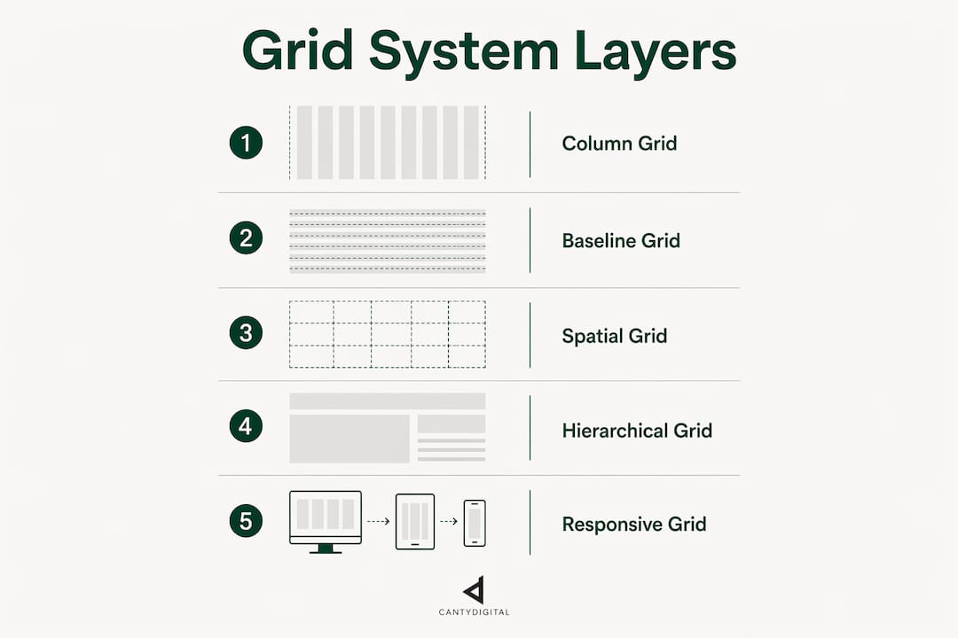
The consequences of skipping this coordination are visible in finished products. Layouts where column widths are defined but spacing is arbitrary produce an unsettled feeling that users notice even if they cannot name it. Misaligned spacing between components breaks the visual rhythm that grids are designed to create.
Real projects benefit from this approach in practical ways. A product page using a 12-column grid for its hero section, baseline grid for its description copy, and 8pt spacing for its button padding will feel cohesive at every zoom level. Change one layer without updating the others and the system breaks down.
CSS Grid, now a native browser primitive, makes implementing multi-layer strategies far more practical than it was with older frameworks. CSS Grid enables designers to treat grids as genuine design tools rather than workarounds, which means the multi-layer approach is accessible to any team working with modern front-end code.
Pro Tip: Document your grid tokens (column count, gutter width, margin, baseline unit) in a shared design system file. When developers and designers reference the same spatial rules, handoff friction drops significantly and the finished build matches the design far more closely.
Applying a consistent grid across multiple brand surfaces, from your marketing site to your app to your email templates, supports cohesive brand recognition. Designers working on consistent branding across web properties find that a shared grid is the fastest way to achieve visual unity without dictating every design decision.
How to effectively implement grid systems for content and user goals
The most common grid mistake is designing the grid first and then forcing content into it. Content-first grid derivation produces better outcomes. Start by mapping your content types, then define the grid structure that serves them best.
Responsive implementation follows a mobile-first sequence. Define your 4-column mobile grid, establish gutter widths and margins at that breakpoint, then expand to tablet and desktop grids. This prevents the common problem of desktop-first designs that break badly on smaller screens.
Testing grid flexibility is non-negotiable. Effective grids must handle content variability, which means testing with short headlines, long headlines, missing images, and overflow text. CSS techniques like flexible heights and min-heights keep layouts stable when content does not behave as expected.
Grids also reduce friction between design and development teams. Shared grid tokens and documentation reduce guesswork, support modular codebases, and make maintenance faster. Teams that align on grid rules before development begins ship more consistent products with fewer revision cycles. This is directly relevant to modular web design workflows where components need to slot into multiple layout contexts.
Common pitfalls to avoid when implementing grids:
- Designing for desktop first and retrofitting mobile grids as an afterthought
- Using too many columns on mobile, which fragments content unnecessarily
- Ignoring gutter widths, which causes content to feel cramped or disconnected
- Treating the grid as fixed rather than as a flexible system that adapts to content
- Skipping documentation, which leaves developers guessing at spacing values
- Applying a hierarchical grid without editorial judgement, producing chaotic layouts
Key takeaways
Grid systems are the structural foundation of every well-designed, responsive website, and applying a multi-layer approach using 12-column layouts, baseline grids, and 8pt spacing produces the most cohesive and maintainable results.
| Point | Details |
|---|---|
| Grids reduce cognitive load | Users process information up to 38% faster with consistent grid layouts applied across a site. |
| 12-column grid is the standard | Its divisibility into 2, 3, 4, and 6 columns makes it the most flexible starting point for responsive web design. |
| Multi-layer grids solve distinct problems | Combining column, baseline, and 8pt spacing grids creates cohesion from page layout down to element padding. |
| Content-first derivation works best | Define your content types before your grid structure to avoid forcing content into rigid, unsuitable layouts. |
| Shared grid rules improve team output | Documented grid tokens reduce designer-to-developer handoff friction and produce more consistent finished builds. |
Why grids are still the most underrated tool in a designer’s kit
After working across dozens of web projects, the pattern I keep seeing is this: the sites that feel polished and trustworthy almost always have a disciplined grid underneath them. The sites that feel off, where something is wrong but you cannot quite name it, almost always have inconsistent spacing and arbitrary alignment.
Grids are not a constraint on creativity. They are the contract that holds everything else together. Typography, imagery, white space, and colour all land differently when they sit on a shared spatial system. Without that system, even beautiful individual elements feel disconnected.
What I find most interesting is how grids affect team dynamics. When a design system includes documented grid tokens, developers stop making spatial guesses. Designers stop re-explaining alignment decisions in every review. The grid becomes a shared language, and that shared language speeds up every stage of production.
The shift to CSS Grid as a native browser tool has removed the last excuse for skipping proper grid implementation. There is no longer a technical barrier. The only barrier is the habit of treating grids as optional rather than foundational. Treat them as foundational, and the quality of your work will reflect it.
— Matthew
CantyDigital builds websites on grid principles that actually work

CantyDigital applies modern grid standards, including 12-column layouts, 8pt spacing systems, and baseline typography grids, to every web project we take on. Our Wollongong-based team has 12 years of experience building sites that are visually consistent, responsive across devices, and built with SEO and performance in mind from the first wireframe. If you want a website that holds together at every breakpoint and on every screen, our web design services are built around exactly these principles. You can also visit our website design FAQs to get answers to common questions before you reach out.
FAQ
What is the role of grid systems in web design?
Grid systems organise content into structured columns, rows, and spacing to create consistent, readable, and responsive layouts. They reduce cognitive load for users and remove layout guesswork for designers and developers.
Why is the 12-column grid the industry standard?
The 12-column grid divides evenly into 2, 3, 4, and 6 columns, giving designers maximum flexibility to create layouts that reflow cleanly across mobile, tablet, and desktop screen sizes.
What is the 8pt spacing system?
The 8pt system sets all margins, padding, and gaps to multiples of 8 pixels (or 4 pixels for finer control), creating consistent visual rhythm across every element in an interface.
How do grids help with responsive design?
Fluid and column grids define how content reflows at different breakpoints, making it straightforward to build layouts that work on any screen size without rebuilding the design from scratch.
Do grids improve accessibility?
Consistent grid layouts create predictable reading orders and tab sequences, which directly benefits keyboard users and people using screen readers or other assistive technologies.


