

The lead capture website elements worth implementing right now are: landing-page forms, embedded forms, pop-ups and modals, slide-ins and sticky bars, chatbots and live chat, multi-step forms, gated content gates, quizzes and interactive tools, exit-intent overlays, and CTA, contact, or demo-request forms.
Here is the shortlist at a glance:
- Landing-page forms — dedicated pages built around a single offer
- Embedded forms — inline forms sitting inside blog posts or product pages
- Pop-ups and modals — triggered overlays that interrupt browsing with an offer
- Slide-ins and sticky bars — persistent but less intrusive capture strips
- Chatbots and live chat — conversational capture that qualifies in real time
- Multi-step forms — split across screens to reduce perceived friction
- Gated content gates — download or access forms tied to a value asset
- Quizzes and interactive tools — engagement-first capture with personalised results
- Exit-intent overlays — triggered when a visitor moves to leave
- CTA, contact, and demo-request forms — direct conversion forms on high-intent pages
Two numbers worth keeping front of mind: cutting one non-essential field can significantly lift conversions, and leads contacted very quickly after submission are much more likely to qualify than those reached much later. Those two facts alone should shape every decision you make about form design and routing.
Table of Contents
- What a lead-capture website element is and why it matters
- The 10 types of lead capture website elements explained
- Why lead-capture elements fail to convert
- Design and copy best practices for lead-capture elements
- Display rules and behavioural targeting
- Technical implementation: tools, integrations and tracking
- KPIs, tracking and an optimisation workflow
- Copy templates for common lead-capture scenarios
- The rules CantyDigital applies to every client project
- How to choose which elements to implement first
- Key takeaways
- The part most guides skip
- CantyDigital builds lead-capture systems that actually route
- Further reading and sources
What a lead-capture website element is and why it matters
A lead-capture element is any on-page mechanism that exchanges a visitor’s contact details for something they value, whether that is a guide, a demo, a discount, or simply an answer to their question.
The core exchange is always the same: the visitor gives you data (name, email, phone, company) and you give them something worth having. Remove the value from that exchange and the form becomes a barrier, not a gateway.
Capture elements sit at the middle of the marketing funnel, between the traffic-driving work of SEO and paid ads and the revenue-driving work of sales. They are the mechanism that converts anonymous visitors into known contacts.
The distinction between passive and active capture matters practically. Passive elements sit in predictable places — a footer newsletter signup, a contact page form — and wait for visitors who are already motivated. Active elements use behavioural triggers (scroll depth, time on page, exit intent) to intercept visitors who might otherwise leave without converting. Active capture outperforms passive when the trigger matches the visitor’s intent; fire it at the wrong moment and it damages the experience.

For Australian businesses, every email capture element must comply with the Privacy Act 1988 and the Australian Privacy Principles (APPs), and any subsequent email marketing must meet the Spam Act 2003 requirements for consent, identification, and unsubscribe functionality. A one-line consent statement near the submit button is not optional.
The 10 types of lead capture website elements explained
Each element type below covers what it captures, where it works best, its pros and cons, and the display or trigger rules that make it perform.
Landing-page forms
A landing page is a standalone page stripped of competing navigation, built entirely around one offer and one form. The page and the form are inseparable: the page exists to justify the form, and the form is the only action available.

Typical data captured: name, email, company, phone (B2B), or just email (B2C).
Best placement: paid traffic destinations, webinar registrations, gated asset downloads.
Pros: high conversion focus, no navigation distractions, easy to A/B test.
Cons: requires dedicated page creation; poor for organic discovery traffic.
Removing header and footer navigation from landing pages reduces exit points and keeps visitors focused on the offer. For mobile, keep the form above the fold or immediately below a short headline so visitors do not need to scroll before they see the ask.
Accessibility note: use <label> elements linked to each input, not placeholder text alone. Placeholder text disappears on focus and fails contrast requirements.
Embedded forms
An embedded form lives inside the body of a page — mid-article, at the end of a blog post, or within a product description. It does not interrupt; it appears as part of the content flow.
Typical data captured: email address, first name.
Best placement: blog posts, resource pages, long-form content.
Pros: low friction, contextually relevant, does not disrupt the reading experience.
Cons: easy to scroll past; lower visibility than triggered elements.
Match the offer to the content. An embedded form at the end of a post about Google Ads should offer a Google Ads checklist, not a generic newsletter. Relevance is what lifts completion rates here.
Pro Tip: Place an embedded form at the 60–70% scroll point of long articles, not just at the bottom. Readers who reach that depth are engaged; those who bounce early never see a footer form anyway.
Pop-ups and modals
A modal is a full-screen or centred overlay that appears over the page content and requires the visitor to act or dismiss it. Done well, it is one of the highest-converting elements on a site. Done badly, it is the fastest way to earn a bounce.
Typical data captured: email, first name, sometimes phone.
Best placement: blog posts, homepage, category pages.
Pros: high visibility, hard to miss, flexible triggers.
Cons: intrusive if mistimed; can increase bounce rate if fired immediately.
Trigger rules matter enormously. A modal that fires after 30 seconds or 50% scroll depth performs far better than one that fires on page load. Frequency cap at once per session, and suppress it for returning subscribers. On mobile, Google’s intrusive interstitials penalty applies to full-screen pop-ups that block content on load, so use a smaller banner-style format for mobile visitors.
Slide-ins and sticky bars
A slide-in enters from the corner or side of the screen after a scroll trigger. A sticky bar sits pinned to the top or bottom of the viewport throughout the session. Both are persistent without being as disruptive as a modal.
Typical data captured: email, first name.
Best placement: blog posts (slide-in), site-wide announcements or promotions (sticky bar).
Pros: always visible without blocking content; lower abandonment risk.
Cons: can feel repetitive on long sessions; limited space for copy.
Sticky bars work well for time-sensitive offers (“Free strategy call this week”) or site-wide lead magnets. Slide-ins suit content upgrades matched to a specific post topic.
Chatbots and live chat
A chatbot or live chat widget captures leads through conversation rather than a static form. The visitor types a question; the bot (or a human) qualifies them and collects contact details as part of the exchange.
Typical data captured: name, email, phone, intent signal, budget range.
Best placement: pricing pages, homepage, product or service pages.
Pros: high engagement, real-time qualification, works outside business hours.
Cons: requires setup and maintenance; bot conversations can feel impersonal if scripted poorly.
For B2B businesses, a chatbot on the pricing page that asks “What are you trying to solve?” before requesting an email collects far more useful data than a static form. Route qualified responses directly to a CRM with a sales notification.
Multi-step forms
A multi-step form breaks a longer form into two or more screens, showing only a few fields at a time. The first screen asks easy questions (name, email); later screens ask higher-friction questions (budget, timeline, company size).
Typical data captured: full qualification data — name, email, company, role, budget, timeline.
Best placement: demo request pages, B2B contact pages, service enquiry pages.
Pros: collects more data with less perceived friction; multi-step popups reduce abandonment on longer forms.
Cons: more complex to build; requires clear progress indicators.
The psychology here is commitment and consistency. Once a visitor has answered the first screen, they are more likely to complete the second. Start with name and email, then ask the qualifying questions.
Gated content gates
A content gate sits in front of a downloadable asset — a whitepaper, checklist, template, or report — and requires a form submission to unlock access. The asset is the value exchange.
Typical data captured: name, email, company, role (B2B).
Best placement: resource pages, blog posts with downloadable assets, dedicated landing pages.
Pros: high intent signal; visitors who download a detailed guide are genuinely interested.
Cons: friction can deter casual browsers; asset quality must justify the ask.
The asset quality determines whether the gate converts. A two-page PDF that could have been a blog post will not justify an email address. A 20-page industry report with original data will.
Accessibility note: provide an accessible PDF and confirm the download confirmation page is screen-reader friendly.
Quizzes and interactive tools
A quiz or interactive calculator captures leads by delivering personalised results in exchange for contact details. The visitor invests time answering questions; the results are the value.
Typical data captured: email, name, sometimes phone or company.
Best placement: blog posts, homepage, dedicated quiz landing pages.
Pros: high engagement; self-segmenting (quiz answers reveal intent and fit); memorable.
Cons: higher build effort; results must feel genuinely personalised to justify the email ask.
A “What’s your website conversion score?” quiz for a digital agency, or a “Which accounting software suits your business?” tool for a software vendor, both deliver value and capture a qualified lead simultaneously.
Exit-intent overlays
An exit-intent overlay fires when the visitor’s cursor moves toward the browser’s close button or address bar, signalling they are about to leave. It is a last-chance offer.
Typical data captured: email, sometimes phone.
Best placement: pricing pages, product pages, checkout pages, blog posts.
Pros: catches visitors who would otherwise leave with nothing; high visibility at a critical moment.
Cons: can feel desperate if the offer is weak; suppression logic is critical to avoid annoying returning visitors.
The offer must match the exit context. On a pricing page, offer a free consultation or a comparison guide. On a blog post, offer the content upgrade. A generic “Subscribe to our newsletter” exit overlay on a pricing page is a missed opportunity.
CTA, contact and demo-request forms
These are the direct conversion forms on high-intent pages: “Book a demo,” “Get a quote,” “Contact us.” They are not triggered by behaviour; they are placed where visitors with purchase intent naturally land.
Typical data captured: name, email, phone, message or project details.
Best placement: contact page, pricing page, service pages, homepage hero section.
Pros: captures the highest-intent visitors; direct pipeline contribution.
Cons: low volume relative to top-of-funnel elements; every field counts.
For B2B, a three-field minimum (name, email, company or message) is the practical floor. Adding a calendar booking integration to a demo-request form removes the back-and-forth and dramatically shortens time-to-first-contact.
Comparison summary
| Element type | Typical data captured | Best-for page | Friction level |
|---|---|---|---|
| Landing-page form | Name, email, company | Paid traffic, gated assets | Medium |
| Embedded form | Email, first name | Blog, resource pages | Low |
| Pop-up / modal | Email, first name | Blog, homepage | Medium |
| Slide-in / sticky bar | Email, first name | Blog, site-wide | Low |
| Chatbot / live chat | Name, email, intent | Pricing, homepage | Low–Medium |
| Multi-step form | Full qualification data | Demo request, B2B contact | Medium–High |
| Gated content gate | Name, email, company | Resource pages | Medium |
| Quiz / interactive tool | Email, name, intent | Blog, homepage | Low–Medium |
| Exit-intent overlay | Email, phone | Pricing, product pages | Low |
| CTA / demo-request form | Name, email, phone, message | Contact, pricing, service | Medium |
Why lead-capture elements fail to convert
Most underperforming forms share the same handful of problems. Recognising them is the first step to fixing them.
- Too many fields. Asking for phone, company, job title, budget, and message on a first-touch newsletter form is a conversion killer. Each extra field reduces completion. Cut to what you genuinely need at that stage.
- Wrong timing. A pop-up that fires on page load before the visitor has read a single sentence signals that you value their email more than their experience.
- Weak value exchange. “Subscribe for updates” is not a value proposition. “Get the 10-point landing page checklist” is. The offer must be worth the data.
- Slow follow-up. Capturing a lead and responding 48 hours later is nearly as bad as not capturing it at all. Automation should route and notify within minutes.
- No trust signals. A form with no privacy line, no company name, and no social proof near it asks visitors to trust a stranger. Add a one-line consent statement and a brief note on how the data is used.
- Poor mobile experience. A form with tiny tap targets, no autocomplete attributes, and a submit button below the fold will lose most mobile visitors before they complete it.
- Missing analytics. If form submissions are not tracked as conversion events, you cannot measure what works. Broken tracking is one of the most common and most avoidable technical mistakes.
- No suppression logic. Showing the same pop-up to someone who already subscribed last week is a UX failure. Suppress elements for known contacts and recent converters.
Pro Tip: The single fastest fix for a low-converting form is almost always field reduction. Remove one field, measure the result. Repeat until you hit the minimum viable ask for that stage of the funnel.
A high-converting form needs five things: a clear value proposition, the right fields, a strong CTA, trust signals, and a confirmation flow. Skip any one of them and you have a leak in the funnel.
Design and copy best practices for lead-capture elements
Field count
Three fields is the practical floor for a B2B first-touch form (name, email, company). Five fields is the ceiling for an initial gate. Beyond five, completion rates drop sharply. Cutting one non-essential field lifts conversions by 30–50%.
Field-count rule: ask only for what you will use in the next 24 hours. If you cannot name a specific action you will take with a field’s data this week, remove it.
CTA copy
Generic labels like “Submit” or “Send” underperform because they describe an action, not an outcome. Outcome-focused CTA copy — “Get the guide,” “Book my demo,” “Start my free audit” — tells the visitor what they receive, not what they do. Use a contrasting button colour that stands out from the page’s primary palette; the button should be impossible to miss.
Visual hierarchy
Single-column forms outperform multi-column layouts on mobile and perform comparably on desktop. The form heading should state the value exchange plainly (“Download the 2026 SEO checklist — free”). Remove extraneous navigation on dedicated landing pages to keep the visitor focused on the single action available.
Trust signals
Place a one-line privacy statement directly below the submit button: “We respect your privacy. No spam, ever.” Link it to your privacy policy. For Australian sites, this also satisfies the APP requirement to notify individuals of data collection at the point of collection. Social proof near the form (a short testimonial count, a client logo strip, or a star rating) reduces hesitation on higher-friction forms.
Do/don’t checklist:
- Do use outcome-focused CTA copy
- Do keep fields to three to five for initial capture
- Do include a privacy line below the submit button
- Do use a single-column layout
- Do test button colour contrast
- Don’t use “Submit” as CTA copy
- Don’t ask for phone on a first-touch newsletter form
- Don’t place the form below the fold on a landing page
- Don’t remove the confirmation message after submission
- Don’t skip the privacy consent line
Pro Tip: Order fields by friction level, not by what feels logical to you. Ask for name and email first. Ask for budget or company size last. Visitors who complete the first field are far more likely to finish the form.
Display rules and behavioural targeting
Showing the right element to the right visitor at the right moment is what separates a well-architected capture system from a collection of random pop-ups. Behavioural targeting is the mechanism that makes that possible.
Common triggers
- Time on page: fire after 30–45 seconds to allow the visitor to engage with content first
- Scroll depth: 50–70% scroll is a reliable signal of genuine interest
- Exit intent: cursor movement toward the browser chrome on desktop
- Click intent: visitor clicks a specific element (a pricing table row, a product image)
- Referral source: show a campaign-specific offer to visitors arriving from a paid ad
- UTM parameters: match the offer to the campaign the visitor came from
Frequency capping and session rules
Show each element once per session as a baseline. For pop-ups, suppress for 7–14 days after a visitor dismisses without converting. Never show the same element to a visitor who has already submitted that form. For returning visitors who are known contacts, suppress all capture elements entirely or show a different, relationship-appropriate offer.
Segmentation examples
- New visitor on a blog post: slide-in content upgrade matched to the post topic, triggered at 60% scroll
- Returning visitor on a pricing page: exit-intent overlay offering a free 30-minute strategy call
- Paid traffic visitor on a landing page: no pop-ups; the landing page form is the only capture element
- Logged-in user: suppress all capture elements; they are already a contact
Pro Tip: Use real-time web personalisation to match the offer to the visitor’s traffic source. A visitor from a Google Ads campaign for “web design Wollongong” should see a form offering a free website audit, not a generic newsletter signup.
Technical implementation: tools, integrations and tracking
A capture element that fires correctly but routes nowhere is just a data collection dead end. The technical stack behind the form matters as much as the form itself.
Integration checklist
- Form embed method: choose between a JavaScript embed (most flexible, works with any CMS), an iframe embed (simpler but harder to style), or a native CMS form block
- Webhook routing: connect form submissions to your CRM or email platform via webhook for real-time delivery; avoid email-only notifications for high-volume forms
- Double vs single opt-in: single opt-in is faster for lead capture; double opt-in produces a cleaner list and is the safer choice for email marketing compliance under the Spam Act 2003
- Calendar booking integration: for demo-request forms, connect directly to a booking tool (Calendly or equivalent) to eliminate scheduling friction
- CRM field mapping: map UTM source, medium, campaign, and content parameters to CRM fields at submission so every lead carries its traffic source
- UTM capture: use a hidden field in the form to capture the full UTM string from the URL
Tools worth knowing
Mailchimp is the most widely used email capture and automation platform for small businesses in Australia. Its embedded and pop-up form builders connect directly to audience lists, and its automation workflows handle double opt-in and welcome sequences out of the box.
FluentCRM is a WordPress-native CRM and email marketing plugin that handles segmentation, automation, and form integration without a third-party subscription. It suits businesses running WordPress who want CRM functionality inside their existing stack rather than a separate SaaS tool.
Basin is a server-side form backend that accepts submissions from any HTML form via a simple action URL. It handles spam filtering, email notifications, and webhook forwarding without requiring a JavaScript form builder. It is particularly useful for custom-built or static sites where a full form platform is overkill.
Spam and bot protection
- Honeypot fields: a hidden field that bots fill in but humans ignore; submissions with a populated honeypot are discarded
- CAPTCHA: reCAPTCHA v3 runs invisibly and scores submissions by behaviour; use v2 checkbox only as a fallback
- Rate limiting: restrict submissions from the same IP to prevent bulk spam
- Server-side validation: never rely solely on client-side validation; validate and sanitise all inputs on the server
Analytics and event tracking
Pro Tip: Track four events per form: form open (the element became visible), first field interaction, submit attempt, and submit success. That sequence tells you exactly where visitors drop off and whether your confirmation flow fires correctly.
Recommended GA4 events:
form_view— element rendered and visibleform_start— first field interactionform_submit— submit button clickedform_success— confirmation page or thank-you message loadedform_error— validation error returned
For Australian businesses, note that storing form submission data on servers outside Australia may trigger APP 8 (cross-border disclosure) obligations. Check your form platform’s data residency settings.
KPIs, tracking and an optimisation workflow
Measuring lead-capture performance means tracking both the capture event and what happens to the lead afterwards.
Primary KPIs
- Conversion rate per element: submissions divided by impressions or page views for that element
- Cost per lead (CPL): total spend divided by leads generated (relevant for paid traffic)
- Lead quality rate: qualified leads (MQLs) as a percentage of total leads captured
- Time-to-first-contact: minutes between submission and first sales touchpoint
- Downstream pipeline contribution: revenue or pipeline value attributed to leads from each element
Secondary signals
- Form abandonment rate: visitors who started but did not submit
- Field-level drop-off: which specific field causes the most exits (requires field-level tracking)
- Bounce rate after interaction: visitors who submitted and immediately left (may signal a poor confirmation experience)
- Mobile vs desktop conversion rate: a significant gap usually points to a mobile UX problem
Measurement checklist
- Confirm all five GA4 form events fire correctly in DebugView before launch
- Set up a GA4 conversion event on
form_successfor each distinct form - Map UTM parameters to CRM fields and verify they populate on test submissions
- Define your A/B test sample size before starting (use a sample size calculator to avoid underpowered tests)
- Run tests for a minimum of two full business weeks to account for day-of-week variation
- Measure both upstream (conversion rate) and downstream (lead quality, pipeline) impact before declaring a winner
Optimisation workflow
Hypothesise → A/B test → measure upstream and downstream → implement winner → monitor for regression.
A conversion rate optimisation cycle for a lead-capture element typically runs two to four weeks per test. Prioritise tests by expected impact multiplied by ease of implementation: field reduction and CTA copy changes are high-impact and low-effort; layout redesigns are high-effort and should follow, not precede, the quick wins.
Copy templates for common lead-capture scenarios
These templates are ready to adapt. Swap the specifics for your offer and audience.
1. Gated whitepaper download (3 fields)
Headline: “Download the 2026 [Industry] Benchmark Report — Free”
CTA: “Get the report”
Fields: First name | Email address | Company name
Placement: Dedicated landing page or mid-article embedded form
Mobile note: Stack fields vertically; keep the CTA button full-width
2. Demo request (3–5 fields + calendar)
Headline: “See [Product] in action — book a 20-minute demo”
CTA: “Book my demo”
Fields: First name | Email | Company | Role | (Optional) What are you trying to solve?
Placement: Pricing page, homepage hero, service page
Mobile note: Use a calendar embed that works on touch screens; avoid date-picker inputs that require precise tapping
3. Newsletter signup (1–2 fields)
Headline: “Get weekly [topic] tips — no fluff, unsubscribe any time”
CTA: “Send me the tips”
Fields: Email address | (Optional) First name
Placement: Sticky bar, slide-in, blog post footer
Mobile note: Single-field forms work best in sticky bars on mobile; keep the bar height under 60px
4. Pricing page contact (3–5 fields)
Headline: “Not sure which plan fits? Let’s talk.”
CTA: “Get a recommendation”
Fields: First name | Email | Phone | (Optional) Company | What’s your budget range?
Placement: Pricing page, below the pricing table
Mobile note: Use tel input type for phone to trigger the numeric keyboard
5. Product quiz starter
Headline: “Which [solution] is right for your business?”
CTA: “Start the quiz (2 minutes)”
Fields (post-quiz gate): Email | First name
Placement: Homepage, blog posts, category pages
Mobile note: Keep each quiz screen to one question; use large tap targets for answer buttons
6. Exit-intent discount or offer
Headline: “Wait — before you go. Get [offer] free.”
CTA: “Claim my [offer]”
Fields: Email address
Placement: Exit-intent overlay on pricing or product pages
Mobile note: Exit intent does not work reliably on mobile (no cursor); use a scroll-up trigger instead
Pro Tip: Map UTM parameters to a hidden field in every template above. When a lead from a Google Ads campaign converts three months later, you will know which campaign started the relationship.
The rules CantyDigital applies to every client project
These are the research-backed rules CantyDigital uses when designing capture elements for clients. They are not opinions; each has a sourced finding behind it.
Speed-to-lead is the most underestimated variable in lead capture. A form that converts at 8% but routes to a sales rep within five minutes will outperform a form that converts at 12% but sits in an inbox until the next morning.
| Rule | Finding | Source |
|---|---|---|
| Cut fields to three to five | 30–50% conversion lift from removing one non-essential field | involve.me |
| Use outcome-focused CTA copy | A/B tests support “Get the guide” over “Submit” | VWO |
| Contact within five minutes | — | involve.me |
| Remove navigation on landing pages | High-performing pages strip header/footer to reduce exit points | Cleverly |
| Match offer to page intent | High-intent pages need stronger qualification; discovery pages need lighter asks | OrbitForms |
Agency checklist for Australian sites
- Include a consent checkbox or privacy line on every form that collects email addresses
- Link to your privacy policy from the consent line
- Use double opt-in for email marketing lists to comply with the Spam Act 2003
- State clearly how the data will be used (“We’ll send you the guide and occasional updates”)
- Store data on Australian-based servers where possible, or disclose cross-border transfer in your privacy policy
- Suppress capture elements for visitors who are already known contacts in your CRM
This article is general information, not legal advice. Confirm your specific compliance obligations with a qualified privacy professional or the Office of the Australian Information Commissioner.
How to choose which elements to implement first
Before building anything, inventory every page that could capture a lead: homepage, service pages, blog posts, pricing page, about page. Most sites have three to five high-traffic pages that account for the majority of potential capture opportunities. Start there.
Decision tree: match intent to element
Map visitor intent to the right element type before choosing a tool:
- Research stage (blog, resource pages): embedded form with a content upgrade, or a slide-in at 60% scroll
- Comparison stage (pricing page, features page): chatbot or multi-step form for qualification, exit-intent overlay as a fallback
- Decision stage (contact page, demo page): direct CTA form with calendar integration; no pop-ups needed
A B2B marketing funnel maps neatly to this: top-of-funnel pages need lightweight capture; bottom-of-funnel pages need direct, high-intent forms.
30/60/90-day priority plan
First 30 days (low effort, immediate wins):
- Add a sticky bar or slide-in newsletter signup to the blog
- Add an embedded content upgrade to your two highest-traffic posts
- Verify that your contact form submission fires a GA4 conversion event
Days 31–60 (medium effort, higher return):
- Build a multi-step demo-request form on your pricing or services page
- Add exit-intent overlays to pricing and high-exit pages
- Connect form submissions to your CRM with UTM field mapping
Days 61–90 (higher effort, strategic):
- Build a gated asset (checklist, guide, or report) with a dedicated landing page
- Launch a product or diagnostic quiz
- Set up A/B tests on your highest-volume form (CTA copy and field count first)
Signals that justify higher-effort investments:
- More than 1,000 monthly visitors to a single page
- Active paid campaigns driving traffic to a landing page
- Repeat visitors who are not converting on passive elements
Key takeaways
The single most important rule in lead capture is this: a form that asks for less, routes fast, and matches the offer to the page will outperform a complex, feature-rich form that ignores those three constraints.
| Point | Details |
|---|---|
| Limit fields to three to five | Cutting one non-essential field lifts conversions by 30–50%; ask only for what you will use immediately. |
| Match offer to page intent | Blog pages need content upgrades; pricing pages need demo requests or qualification forms. |
| Use outcome-focused CTA copy | “Get the guide” and “Book my demo” outperform “Submit” in A/B tests; state what the visitor receives. |
| Route and follow up within five minutes | Leads contacted very quickly after submission are much more likely to qualify than those reached much later. |
| CantyDigital for implementation | CantyDigital designs and builds lead-capture systems with CRM integration, compliance-ready consent, and conversion-tested form layouts. |
The part most guides skip
The conversion rate on a form is a vanity metric if the lead goes nowhere. Every article about lead capture focuses on the form itself — the fields, the CTA, the colour of the button. Almost none of them spend serious time on what happens in the 300 seconds after the visitor hits submit.
The businesses that consistently generate pipeline from their websites are not the ones with the cleverest pop-ups. They are the ones with a webhook that fires the moment a form submits, a CRM that creates a contact record and assigns it to a rep, and a notification that reaches that rep’s phone before the visitor has closed the browser tab. The form is the beginning of the process, not the end of it.
The other thing worth saying plainly: most small business websites in Australia have the wrong elements on the wrong pages. A newsletter signup on a pricing page is a missed opportunity. A full-qualification form on a top-of-funnel blog post will convert at a fraction of what a simple content upgrade would. The taxonomy in this article is not academic; it is a practical map for matching the ask to the moment.
Get the routing right. Get the match right. The conversion rate will follow.
CantyDigital builds lead-capture systems that actually route
Most web design projects deliver a contact form and call it lead generation. CantyDigital takes a different approach: every capture element we build is connected to a routing workflow, tracked in GA4, and designed around the specific intent of the page it sits on.
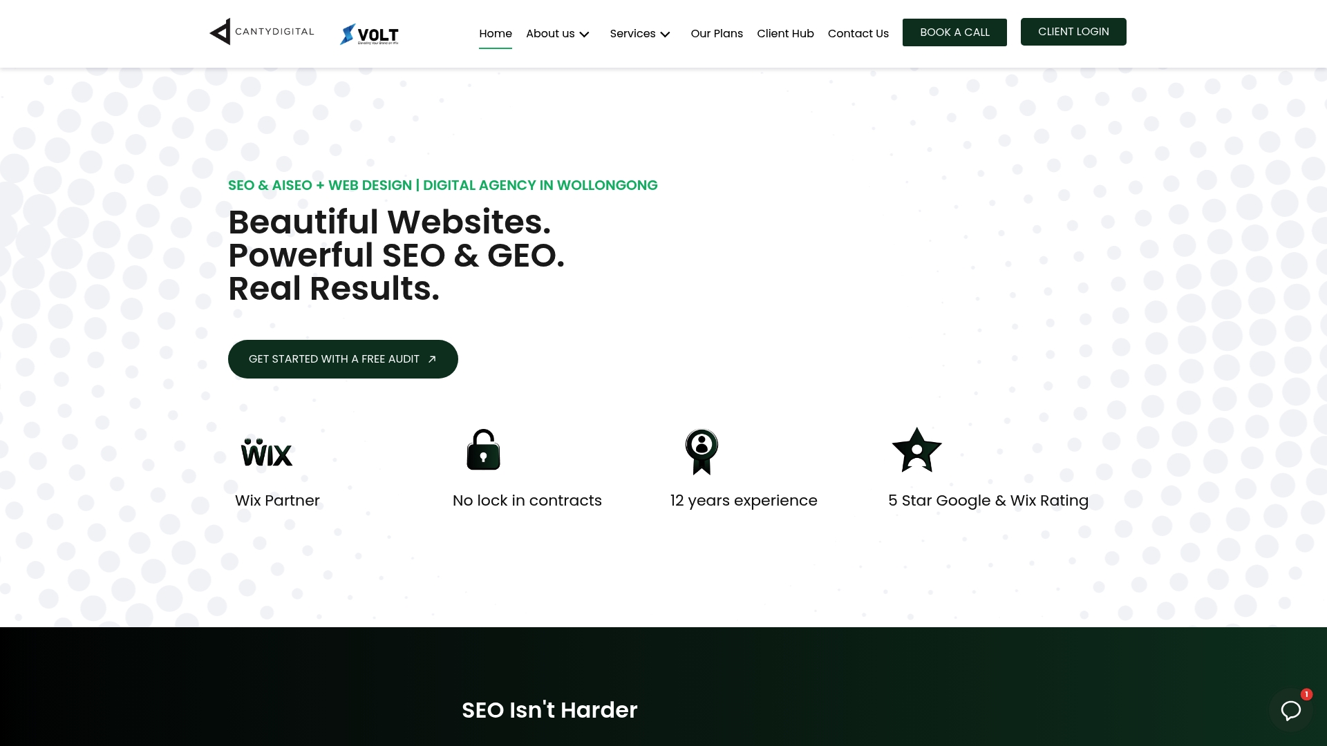
Whether you need a multi-step demo-request form on a B2B service page, a gated asset landing page, or a site-wide capture architecture with CRM integration, CantyDigital handles the design, the build, and the technical setup. No lock-in monthly contracts. Wollongong-based, serving clients across Australia.
If you want a website that captures and routes leads rather than just looking good, see how we approach lead generation or get in touch through our website design service to talk through your specific situation.
Further reading and sources
The findings cited in this article draw on the following sources. Australian compliance references point to primary government sources.
- Lead capture form templates: the high-converting guide — involve.me. Field-count conversion lift data (30–50%), five-component form anatomy, and speed-to-lead findings.
- Design principles that increase conversions — VWO. CTA copy A/B test evidence and visual hierarchy guidance.
- Lead capture strategy for websites — OrbitForms. Three-component capture model (value exchange, mechanism, routing) and intent-matching guidance.
- Lead capture: examples, strategies and case studies — Wisepops. Active vs passive capture, multi-step pop-up data, and display-rule examples.
- Lead capture page guidance — Cleverly. Navigation removal on landing pages and exit-point reduction.
- How to create a lead capture funnel that converts — Picreel. Canonical taxonomy of lead-capture methods.
- Lead capture strategy guide — OrbitForms. Touchpoint inventory and prioritisation framework.
- Office of the Australian Information Commissioner (OAIC) — oaic.gov.au — Australian Privacy Principles (APPs) and Privacy Act 1988 guidance. Australian-relevant.
- Australian Communications and Media Authority (ACMA) — acma.gov.au — Spam Act 2003 compliance requirements for email marketing. Australian-relevant.
Australian compliance note: the Privacy Act 1988 and the Spam Act 2003 set the legal floor for email capture in Australia. The OAIC and ACMA publish plain-language compliance guides that are worth bookmarking for any team managing lead-capture forms.