

A website prototype is an early, testable model of a site that shows structure, interaction and content before a single line of production code is written. Think of it as a working sketch you can click through, share with stakeholders, and hand to developers as a blueprint.
At a glance:
- Validate UX early: prototypes let you test navigation, flows and content hierarchy with real users before committing to development
- Align stakeholders: clients, product owners and developers all see the same interactive model, so sign-off happens faster and with fewer surprises
- Inform development: interactive demos reduce rework by giving developers a clearer picture of what to build
Designers, product owners, developers, marketers and clients all use prototypes. If you are a small business owner planning a new site, a project manager scoping a redesign, or a junior designer about to present to a client, this guide covers everything you need.
Table of Contents
- What is a website prototype, and how does it differ from a wireframe?
- Why prototypes matter: benefits and limitations
- What types of prototypes are there?
- How to create a website prototype step by step
- Which prototyping tools should you use?
- How do you test a prototype with real users?
- What should you include for a smooth developer handoff?
- What do different prototype types look like in practice?
- Key takeaways
- The part most guides get wrong about prototyping
- CantyDigital builds prototypes that actually move projects forward
What is a website prototype, and how does it differ from a wireframe?
People use “wireframe,” “prototype” and “mockup” interchangeably, but they are three distinct things at three different stages.
A wireframe is a bare-bones structural sketch. No colour, no real copy, no interaction. It answers one question: where does each element live on the page?
A prototype comes next. It fills out content and interaction without committing to full visual design, so you can click through flows, test navigation and demonstrate how the site behaves. It sits between the wireframe and the finished build.
A mockup is a static, high-fidelity visual. It looks like the final site but does nothing. Mockups are useful for presenting visual direction to clients, but they cannot be tested the way a prototype can.
| Artefact | Primary purpose | Interactive? | Typical stage |
|---|---|---|---|
| Wireframe | Map structure and layout | No | Discovery / planning |
| Prototype | Test interaction and flow | Yes (usually) | Pre-development |
| Mockup | Present visual design | No | Design sign-off |
When should you build one? A few reliable signals:
- The site has complex interactions (multi-step forms, filtered search, conditional content)
- Stakeholders are uncertain about structure or user flow
- You need to run usability testing before committing budget to development
- A redesign is involved and you want to avoid common website redesign mistakes caused by skipping validation
Why prototypes matter: benefits and limitations
The core value of prototyping is risk reduction. Testing assumptions with an interactive model prevents launching a product that misses user needs and avoids the far higher cost of fixing problems after launch.
Core benefits:
- Usability testing: you can watch real users attempt tasks on the prototype and catch navigation failures before they reach production
- Stakeholder alignment: a clickable model removes ambiguity. Clients react to what they can actually use, not what they imagine from a static PDF
- Developer clarity: annotated prototypes give developers precise interaction specs, reducing back-and-forth during the build
- Cost and time savings: changes to a prototype take minutes; the same change post-launch can take days and cost significantly more
Common limitations to plan for:
- Learning a new tool takes time, especially for teams new to Figma or Axure
- Over-polishing a prototype early wastes effort on details that will change anyway
- Scope creep is real: stakeholders who can click through a prototype often request additions that were never in scope
- Clients sometimes mistake a high-fidelity prototype for the finished site, which creates expectation problems
Pro Tip: Keep your first prototype deliberately rough. A low-fidelity version with placeholder text and grey boxes is enough to test navigation and flow. Save the polish for round two, once the structure is validated.
What types of prototypes are there?
Fidelity is the key variable. Choose it based on what you need to learn, not on how impressive the prototype looks.
Low-fidelity prototypes
These are quick, rough representations: paper sketches, hand-drawn screen flows, or simple greyscale wireframes built in Balsamiq. They are fast to produce (often a few hours), cheap to change, and ideal for early-stage exploration when the structure is still being debated. What is a low-fidelity prototype in practice? It is usually a series of boxes and labels that show layout and flow without any real content or colour.
Mid-fidelity prototypes
Mid-fidelity adds real copy, basic colour and clickable links between screens. You can navigate the flow but the visual design is not final. This is the most common type for stakeholder reviews and early usability testing.
High-fidelity prototypes
High-fidelity prototypes let teams evaluate layout, information architecture and interactivity so stakeholders can sign off before development begins. They look and behave close to the finished site. Use them when you need formal client approval or when the prototype will be handed directly to developers as a spec.
| Type | Looks like | Interactive? | Best for |
|---|---|---|---|
| Low-fidelity | Rough boxes and labels | Minimal | Early exploration, quick team alignment |
| Mid-fidelity | Real copy, basic colour, linked screens | Yes | Stakeholder reviews, early usability testing |
| High-fidelity | Near-final visual design | Yes, with transitions | Client sign-off, developer handoff |
| Static (PDF/image) | Screenshot or export | No | Async review, simple approval |
| Coded (HTML/CSS) | Live in a browser | Fully | Developer handoff, performance testing |
For modular platforms like Shopify or some WordPress themes, the live theme preview can act as a practical prototype that saves time versus building a full high-fidelity mockup from scratch. It is a pragmatic option for businesses on tighter budgets.
How to create a website prototype step by step
Prototyping converts an idea into an interactive model that demonstrates structure, functionality and key design elements so you can test it with users before development starts. Here is a practical workflow.
- Define your goals. Write down what you need to learn from the prototype. “Can users find the contact form?” is a testable goal. “Does it look good?” is not.
- Sketch or wireframe first. Put rough screens on paper or in a simple wireframing tool. Do not open Figma yet. Speed matters here.
- Choose your fidelity and tool. Match fidelity to your goal (see the types section above). Pick a tool that fits your team’s skill level and the project’s complexity.
- Build the prototype. Connect screens with links or transitions. Focus on the primary user flows, not every edge case.
- Test with real users. Run at least five usability sessions. Observe, do not guide. Note where users hesitate or fail.
- Iterate. Fix the problems the tests revealed, then test again if the changes are significant.
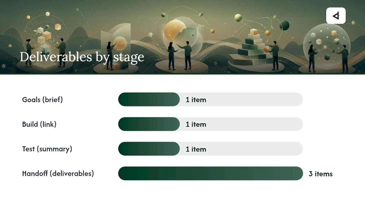
Deliverables at each stage:
- Goals stage: a one-page brief listing what the prototype must demonstrate
- Wireframe stage: annotated screen sketches or low-fi digital frames
- Build stage: a shareable prototype link with interaction notes
- Test stage: a summary of findings with prioritised issues
- Handoff stage: annotated prototype file, asset exports, copy document
Pro Tip: Timebox each iteration. Set a fixed number of hours for each prototype round and stop when the time is up. Unlimited iteration is how prototypes turn into full builds without the budget for one.
Moving from paper to digital early enables asynchronous feedback and easier iteration. Redrawing paper sketches for every minor change creates friction that slows the whole team down.
Which prototyping tools should you use?
The right tool depends on three things: how much fidelity you need, how comfortable your team is with design software, and whether the prototype needs to hand off cleanly to developers.
Tool capsules:
- Figma: the dominant choice for collaborative prototyping. Figma supports clickable prototypes with versioning and comment features that speed stakeholder feedback. Free tier available; paid plans from around USD $15/month per editor. Low-to-moderate learning curve.
- Adobe XD: — solid for teams already in the Adobe ecosystem. Supports interactive prototypes and developer handoff. Included in Creative Cloud subscriptions. Moderate learning curve.
- Balsamiq: — purpose-built for low-fidelity wireframes and quick prototypes. Deliberately rough visual style keeps stakeholders focused on structure, not aesthetics. Subscription with monthly fees. Very low learning curve.
- Axure: — the go-to for complex, logic-driven prototypes with conditional flows and dynamic content. Steep learning curve but unmatched for enterprise-level interaction design. Subscription based pricing. High learning curve.
- UXPin: — bridges design and code. You can build prototypes using real UI components and even import React components. Strong for design-system-driven projects. Subscription based pricing.
- Vev: — a no-code platform suited to motion-rich, editorial and campaign pages. Good for high-fidelity visual prototypes where animation matters. Pricing varies by plan.
| Tool | Best for | Fidelity supported | Cost bracket | Learning curve |
|---|---|---|---|---|
| Figma | Collaborative team prototyping | Low to high | Free / paid | Low to moderate |
| Adobe XD | Adobe ecosystem teams | Mid to high | Creative Cloud | Moderate |
| Balsamiq | Early-stage wireframing | Low | Low subscription | Very low |
| Axure | Complex conditional flows | Mid to high | Mid subscription | High |
| UXPin | Design-system prototyping | Mid to high | Mid subscription | Moderate |
| InVision | Quick clickable review flows | Low to mid | Free / paid | Low |
| Webflow | Coded, publishable prototypes | High / live | Free / paid | Moderate |
| Vev | Motion-rich campaign pages | High | Varies | Moderate |
For a simple landing page, Figma or InVision covers most needs. For a complex multi-step application, Axure or UXPin gives you the conditional logic you need. When the prototype needs to become the live site, Webflow removes the handoff step entirely. For a quick guide on how prototypes feed into high-converting landing page design, that context is worth reading alongside your tool choice.
How do you test a prototype with real users?
Iterative prototyping — build, test, refine — helps teams improve usability and make data-driven design decisions. The testing part is where most teams cut corners, and it is the part that delivers the most value.
Moderated vs unmoderated testing:
- Moderated: a facilitator sits with (or video-calls) the participant and observes in real time. Better for nuanced feedback and follow-up questions. Use this when you need to understand why something failed.
- Unmoderated: participants complete tasks independently using a tool like Maze or Useberry. Faster and cheaper to run at scale. Use this for quantitative data across a larger group.
A simple test session plan:
- Recruit 5–8 participants who match your target user profile
- Write a script with 3–5 specific tasks (e.g. “Find the pricing page and select the mid-tier plan”)
- Brief participants: explain this is a test of the design, not of them
- Observe without intervening. Note where they pause, click the wrong thing, or express confusion
- Record the session (with consent) for later review
- Summarise findings: list issues by frequency and severity
Useful metrics to capture:
- Task success rate (did the user complete the task?)
- Time on task (how long did it take?)
- Error rate (how many wrong clicks before success?)
- Qualitative notes (what did they say aloud?)
For a broader look at UX testing and A/B strategies that complement prototype validation, that resource covers the optimisation side of the equation well.
What should you include for a smooth developer handoff?
A prototype that cannot be handed off cleanly is half a job. Developers need more than a clickable file; they need precise specs, annotated states and export-ready assets.
Asset checklist for handoff:
- Screen dimensions and grid specifications
- Typography: font names, sizes, weights and line heights for every text style
- Colour values in HEX and RGB
- Spacing and padding measurements for every component
- Export-ready images and icons at the correct resolutions
- Final copy for every screen, including error messages and empty states
- Interaction notes: what triggers each transition, what the animation timing is
How to annotate effectively:
- Label every interactive state (default, hover, active, disabled, error)
- Note breakpoints: show how each component behaves at mobile, tablet and desktop widths
- Document edge cases: what happens when a form field is left blank, or a list has zero items?
- Add a component index so developers can find reusable elements quickly
Integrating your prototype with a style guide or design system (Figma’s component libraries work well here) means developers pull consistent tokens rather than guessing values. For projects involving a platform migration, prototyping the new structure before the website migration begins prevents costly structural rework mid-project.
What do different prototype types look like in practice?
Seeing concrete examples makes the fidelity decision much easier.
Low-fidelity: paper or greyscale wireframe
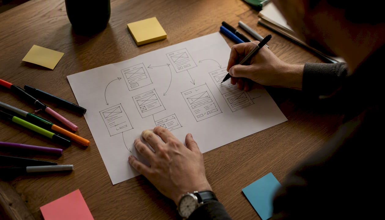
Picture a sheet of A4 with hand-drawn rectangles representing a homepage. A large box at the top is labelled “hero image.” Below it, three smaller boxes sit side by side labelled “service 1,” “service 2,” “service 3.” Arrows connect this page to a “contact” box on a second sheet. There is no colour, no real copy, no logo. A team can review this in ten minutes and agree on structure before anyone opens a design tool. That is the point.
Mid-fidelity: clickable flow in Figma or InVision
Now the same homepage has real headlines, a navigation bar with the client’s actual menu items, and a “Get a quote” button that links to a contact form screen. The colour palette is roughly correct but not final. A stakeholder in Melbourne can open the shared link on their phone, click through the flow, and leave a comment on the form screen asking for a phone field. The designer adds it in ten minutes. This is where most of the real alignment work happens.
High-fidelity: coded prototype in Webflow or HTML
The site is built in Webflow with final typography, real images, hover states and a working mobile layout. A developer can inspect the CSS values directly. A client can view it on their own device and experience the scroll animations as they will appear in production. For projects where the Webflow build is the final site, this prototype and the live product are the same thing. For a sense of what polished web builds look like at this stage, the CantyDigital web design portfolio shows finished projects that started with exactly this kind of structured prototyping process.
Key takeaways
A website prototype is the single most effective tool for catching structural and UX problems before they become expensive development fixes.
| Point | Details |
|---|---|
| Core definition | A prototype is an interactive, testable model built before development to validate structure, flow and content. |
| When to prototype | Build one whenever interactions are complex, stakeholders are uncertain, or usability testing is needed before launch. |
| Fidelity choice | Match fidelity to your goal: low-fi for early exploration, high-fi for sign-off and developer handoff. |
| Test with real users | Run at least five usability sessions per prototype round and iterate on findings, not on preferences. |
| CantyDigital approach | CantyDigital delivers prototype sprints from 8–20 hours for landing pages and 2–5 days for multi-page projects, keeping costs predictable for Australian SMBs. |
The part most guides get wrong about prototyping
There is a persistent idea that prototyping is a design team activity, something that happens in a Figma file between the wireframe and the handoff. In practice, the teams that get the most value from prototypes treat them as a communication tool first and a design artefact second.
The prototype’s real job is to create a shared reality. Before it exists, every stakeholder has a different mental model of what the site will be. The developer imagines one thing, the client imagines another, and the designer is somewhere in between. The prototype collapses all of that into one clickable object everyone can react to in the same way.
What that means practically: the prototype does not need to be beautiful to do its job. A mid-fidelity Figma file with real copy and linked screens will surface more genuine feedback than a pixel-perfect mockup that took three times as long to produce. Clients who see a polished prototype often respond to the aesthetics rather than the structure, which is the opposite of what you need at that stage.
The other thing guides underplay is the handoff. A prototype that lives only in a designer’s Figma account and gets exported as a PDF for the developer is not a handoff. It is a guess. Annotated states, breakpoint behaviour, interaction timing and edge cases need to be documented explicitly. Developers should be able to build from the prototype without a single follow-up question about intent.
At CantyDigital, the prototyping work we do for clients in Wollongong and across Australia consistently shows that the projects with the smoothest builds are the ones where the prototype was treated as a developer document, not just a client presentation. That shift in mindset is worth more than any tool choice.
CantyDigital builds prototypes that actually move projects forward
Most businesses spend too long in the design phase and too little time validating before development starts. CantyDigital’s web design process includes structured prototype sprints that give you a clickable, testable model before a single line of production code is written.
Whether you need a quick landing page prototype or a full multi-page interactive flow, the team at CantyDigital handles the design, the usability testing and the developer handoff so nothing falls through the gaps. Projects are scoped clearly, timelines are fixed, and there are no lock-in contracts.
If you are planning a new site or a redesign and want to know what a prototype sprint would look like for your project, the CantyDigital web design service is a good place to start. For businesses that want the full picture including SEO built in from the ground up, the website design FAQs cover the most common questions before you book a call.