
Web accessibility is defined as the practice of building websites that people with disabilities can perceive, navigate, and interact with fully. The W3C’s Web Content Accessibility Guidelines, known as WCAG 2.2, set the global standard for this practice. Getting it right matters beyond compliance. Accessible design improves usability for mobile users, people on slow connections, and older adults. When you design an accessible website for users across all abilities, you also write cleaner code, rank better in search, and reach a wider audience.
What does it mean to design an accessible website for users?
Web accessibility and inclusive web design are related but not the same thing. Accessibility focuses on removing barriers for people with disabilities. Inclusive design is the broader philosophy. The Interaction Design Foundation defines inclusive design as proactively planning for human diversity from the start, covering age, culture, language, and context, not just disability. That distinction matters because it shifts your mindset from fixing problems after launch to preventing them during planning.
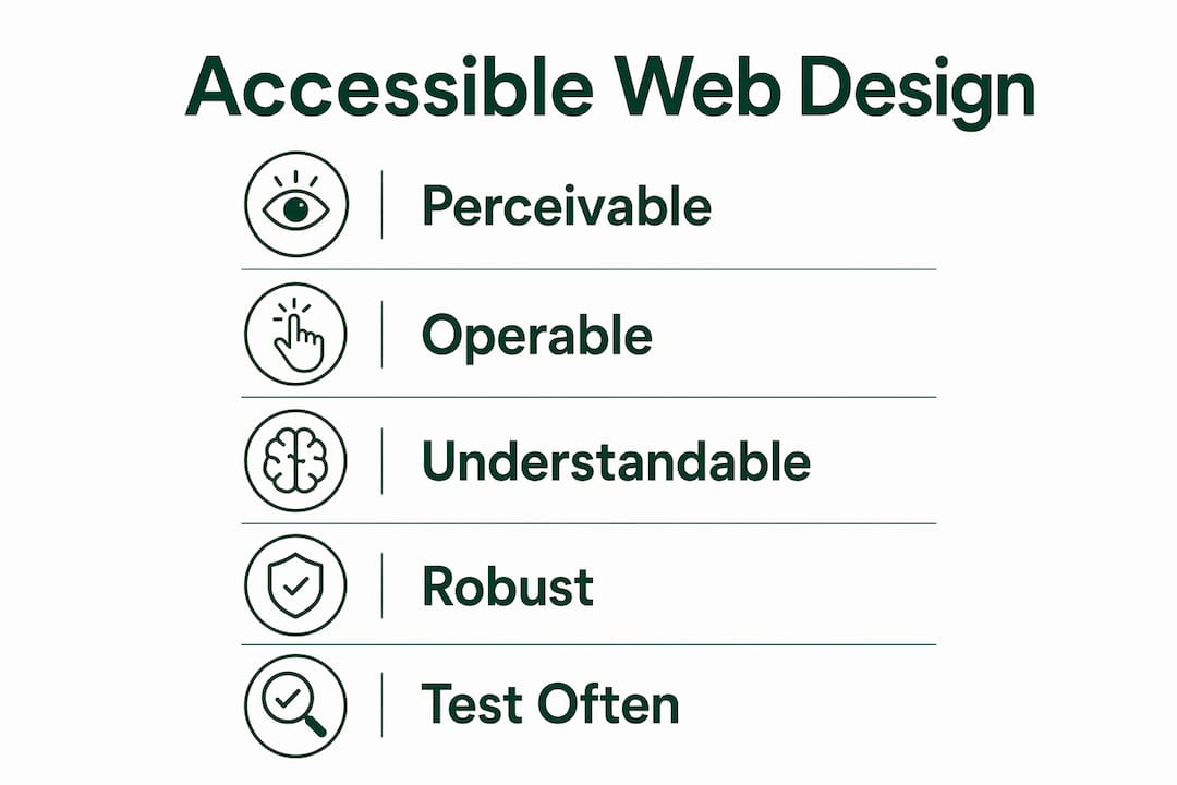
The WCAG 2.2 framework organises accessibility requirements into four principles, known as POUR:
- Perceivable. Users must be able to see or hear all content. This means providing text alternatives for images, captions for video, and sufficient colour contrast.
- Operable. All functions must work without a mouse. Keyboard navigation, skip links, and visible focus indicators fall under this principle.
- Understandable. Content and interfaces must be clear. Plain language, consistent navigation, and helpful error messages are the core requirements.
- Robust. Code must work across browsers and assistive technologies. Semantic HTML and valid markup are the foundation.
These four principles apply whether you are building a simple brochure site or a complex web application. They give you a structured checklist rather than a vague aspiration.
Pro Tip: Start every new project with a POUR audit of your wireframes before writing a single line of code. Catching contrast or structure problems at the wireframe stage costs a fraction of fixing them after development.
Inclusive design goes one step further. It asks you to consider users who speak English as a second language, users in bright sunlight on a phone, and users who are temporarily injured. Designing for those edge cases almost always produces a better experience for everyone else.
What are the essential technical requirements for accessible web design?
The technical foundation of any accessible website rests on three pillars: contrast ratios, semantic HTML, and keyboard operability. Get these right and you satisfy the majority of WCAG 2.2 success criteria at the AA conformance level.

WCAG 2.2 requires a contrast ratio of at least 4.5:1 for body text and 3:1 for large text, defined as text 18pt or 14pt bold. That ratio is the minimum. Aiming for 7:1 gives you AAA conformance and noticeably better readability in poor lighting conditions.
Semantic HTML and a logical heading hierarchy improve screen reader navigation and search engine performance at the same time. A screen reader user navigates a page by jumping between headings, much like a sighted user scans visually. If your H1 through H6 tags are out of order or replaced with styled <div> elements, that navigation breaks entirely.
| Requirement | WCAG 2.2 criterion | Practical implementation |
|---|---|---|
| Body text contrast | 4.5:1 minimum | Use a contrast checker during design |
| Large text contrast | 3:1 minimum | Apply to headings 18pt+ or 14pt bold |
| Keyboard navigation | 2.1.1 Keyboard | Test every interactive element without a mouse |
| Semantic structure | 1.3.1 Info and Relationships | Use correct HTML5 elements and heading order |
| Form labels | 1.3.1 Info and Relationships | Programmatically link every label to its input |
| Focus indicators | 2.4.7 Focus Visible | Never remove the browser’s default outline without replacing it |
Testing tools accelerate this work considerably. The Figma Stark plugin checks contrast and simulates colour blindness directly in your design file. Browser extensions like axe DevTools and WAVE scan live pages for WCAG violations. Neither tool replaces manual testing, but both catch the most common errors before they reach production.
Pro Tip: Add an automated accessibility scan to your CI/CD pipeline using axe-core. It runs on every build and flags regressions before they go live, keeping your team accountable without adding manual overhead.
Accessibility improvements also carry an SEO benefit. Semantic markup is cleaner and faster, which search engines and assistive technologies both reward. The same code that helps a screen reader user find your main navigation helps Google understand your page structure.
How do you implement accessible content and interactive elements?
Implementation is where most teams stumble. The principles are clear, but translating them into production code and design decisions requires deliberate habits.
Follow these steps when building out your interactive elements and content:
- Make every interactive element keyboard accessible. Full keyboard accessibility means every button, link, dropdown, and modal can be reached and activated using Tab, Enter, and arrow keys alone. Test this by unplugging your mouse and navigating the entire page.
- Write clear, programmatically linked form labels. Every input field needs an associated label connected in code using the
forandidattributes or ARIA labelling. Placeholder text alone does not count. It disappears when the user starts typing and is not reliably announced by screen readers. - Never use colour as the only signal. Colour should not be the sole means of conveying information. A red error border on a form field means nothing to a colourblind user without an accompanying error icon or text label. Add a symbol or a written message alongside any colour cue.
- Choose fonts for legibility, not aesthetics alone. Sans-serif typefaces like Inter, Roboto, or Atkinson Hyperlegible perform better for users with dyslexia or low vision. Set a minimum body font size of 16px and a line height of at least 1.5. These settings reduce reading fatigue for everyone. Cantydigital covers this in detail in the guide on legibility and readability.
- Use white space deliberately. Dense layouts overwhelm users with cognitive disabilities. Generous padding between sections, clear visual groupings, and a single primary action per screen reduce cognitive load and improve task completion rates.
- Avoid auto-playing media. Video or audio that starts without user consent is disorienting for screen reader users and people with attention disorders. Provide controls and default to muted or paused states.
Pro Tip: Run a keyboard-only session on your finished prototype with a colleague who has not seen the design before. Fresh eyes catch focus traps and missing skip links that the original designer overlooks.
Common mistakes to avoid include removing focus outlines with outline: none in CSS without providing a replacement, using <div> or <span> elements as buttons without ARIA roles, and writing link text like “click here” that provides no context to screen reader users.
What testing methods verify and maintain website accessibility?
Accessibility is an ongoing iterative process, not a one-time audit. A site that passes WCAG 2.2 at launch can fail six months later after a content update or a new feature rollout. Building testing into your regular workflow prevents that drift.
Effective accessibility testing combines several methods:
- Automated scanning. Tools like axe DevTools, WAVE, and the Figma Stark plugin catch roughly 30–40% of WCAG issues automatically. They are fast and consistent, making them ideal for catching regressions during development.
- Manual keyboard testing. Navigate every page using only Tab, Shift+Tab, Enter, and arrow keys. Confirm that focus order is logical, focus indicators are visible, and no keyboard traps exist.
- Screen reader testing. Use NVDA on Windows or VoiceOver on macOS and iOS to hear how your content is announced. Pay particular attention to form labels, image alt text, and dynamic content updates.
- Colour blindness simulation. Browser developer tools and design plugins like Stark simulate deuteranopia, protanopia, and other vision types. Run simulations on every page that uses colour to convey meaning.
- User testing with disabled participants. Automated tools and simulations have limits. Testing with real users who rely on assistive technology surfaces issues that no algorithm catches. Even one or two sessions per quarter produces significant improvements.
Integrating accessibility testing into design tool workflows using plugins maintains consistency across the team. When every designer runs a contrast check before handing off to development, contrast failures stop reaching the browser. The same logic applies to development: linting rules and automated tests catch structural issues before they reach staging.
Troubleshooting common issues found during testing usually reveals a short list of recurring problems: missing alt text, insufficient contrast, unlabelled form fields, and missing focus indicators. Fixing these four categories resolves the majority of barriers for most users.
Key takeaways
Designing accessible websites requires applying WCAG 2.2 standards, semantic HTML, and continuous testing from the first wireframe to every future content update.
| Point | Details |
|---|---|
| Apply POUR principles | Structure every design decision around perceivable, operable, understandable, and robust criteria. |
| Meet WCAG 2.2 contrast ratios | Use 4.5:1 for body text and 3:1 for large text as your minimum contrast targets. |
| Use semantic HTML | Correct heading order and HTML5 elements improve both screen reader navigation and SEO. |
| Test continuously | Combine automated tools, keyboard testing, and user sessions with disabled participants. |
| Avoid colour-only signals | Pair every colour cue with a symbol or text label to support colourblind users. |
Accessibility is a design responsibility, not a legal checkbox
Most teams treat accessibility as something to bolt on before launch. I have seen this approach fail repeatedly, and it costs far more than getting it right from the start. When a client calls me six months after launch because their site fails a WCAG audit, the remediation work is always three to five times more expensive than building it in correctly from day one.
The part that surprises most designers is how much accessibility work improves the experience for everyone. Fixing contrast ratios makes text easier to read on a phone in sunlight. Adding keyboard navigation benefits power users who prefer shortcuts. Writing proper semantic HTML, which is the foundation of accessibility compliance in corporate web design, also gives search engines a cleaner signal. The SEO and accessibility goals are not in tension. They reinforce each other.
The future of accessibility is moving toward proactive inclusion rather than reactive compliance. AI-assisted design tools are beginning to flag WCAG violations in real time during the design process. That is a genuine shift. But tools only help if designers understand the principles behind the checks. A tool can tell you the contrast ratio fails. It cannot tell you why the design decision that caused it was wrong in the first place.
My advice is simple: make accessibility a team habit, not a specialist’s job. Every designer on your team should know the POUR principles. Every developer should know how to write a proper form label. When accessibility knowledge is distributed across the team, it stops being a bottleneck and starts being a baseline.
— Matthew
Cantydigital builds websites that work for every user
Accessibility compliance is not optional for businesses that want to reach the widest possible audience and avoid legal risk. Cantydigital is a Wollongong-based digital agency with 12 years of experience building high-performance websites that meet WCAG 2.2 standards from the ground up.
Every site Cantydigital builds uses semantic HTML, tested contrast ratios, and keyboard-accessible interactions as standard. The team also integrates digital design principles that support both accessibility and search performance from the first wireframe. If your current site has accessibility gaps or you are starting a new project, Cantydigital’s web design and accessibility services are the practical next step.
FAQ
What is WCAG 2.2 and why does it matter?
WCAG 2.2 is the W3C’s Web Content Accessibility Guidelines, the global standard for web accessibility. Meeting it at AA level is the accepted benchmark for legal compliance and inclusive design in Australia and internationally.
What contrast ratio do I need for accessible text?
WCAG 2.2 requires a minimum contrast ratio of 4.5:1 for body text and 3:1 for large text. Targeting 7:1 achieves AAA conformance and improves readability in low-light or outdoor conditions.
How do I test my website for accessibility?
Combine automated tools like axe DevTools or WAVE with manual keyboard testing and screen reader checks using NVDA or VoiceOver. User testing with disabled participants surfaces issues that automated tools miss.
Does accessibility help with SEO?
Semantic HTML and logical heading structure improve both screen reader navigation and search engine indexing. Accessible code is cleaner and faster, which benefits search rankings and mobile performance.
What is the difference between accessibility and inclusive design?
Accessibility removes barriers for people with disabilities. Inclusive design is a broader philosophy that plans for human diversity including age, culture, and context from the start of a project, producing better outcomes for all users.