


Mobile usability is defined as the measure of how intuitively and effectively users interact with websites and apps on smartphones and tablets, and it directly shapes your SEO rankings, engagement, and revenue. 62.45% of global internet traffic now comes from mobile devices. That single figure makes mobile usability the most consequential design decision a web professional or business owner faces. Google reinforced this by switching to mobile-first indexing for all search queries, meaning Google crawls and ranks your site based on its mobile version first. If your mobile experience is poor, your rankings suffer regardless of how polished your desktop site looks.
What key factors define mobile usability?
Mobile usability is not a single feature. It is the combined result of several design and performance decisions that determine whether a visitor stays or leaves within seconds.

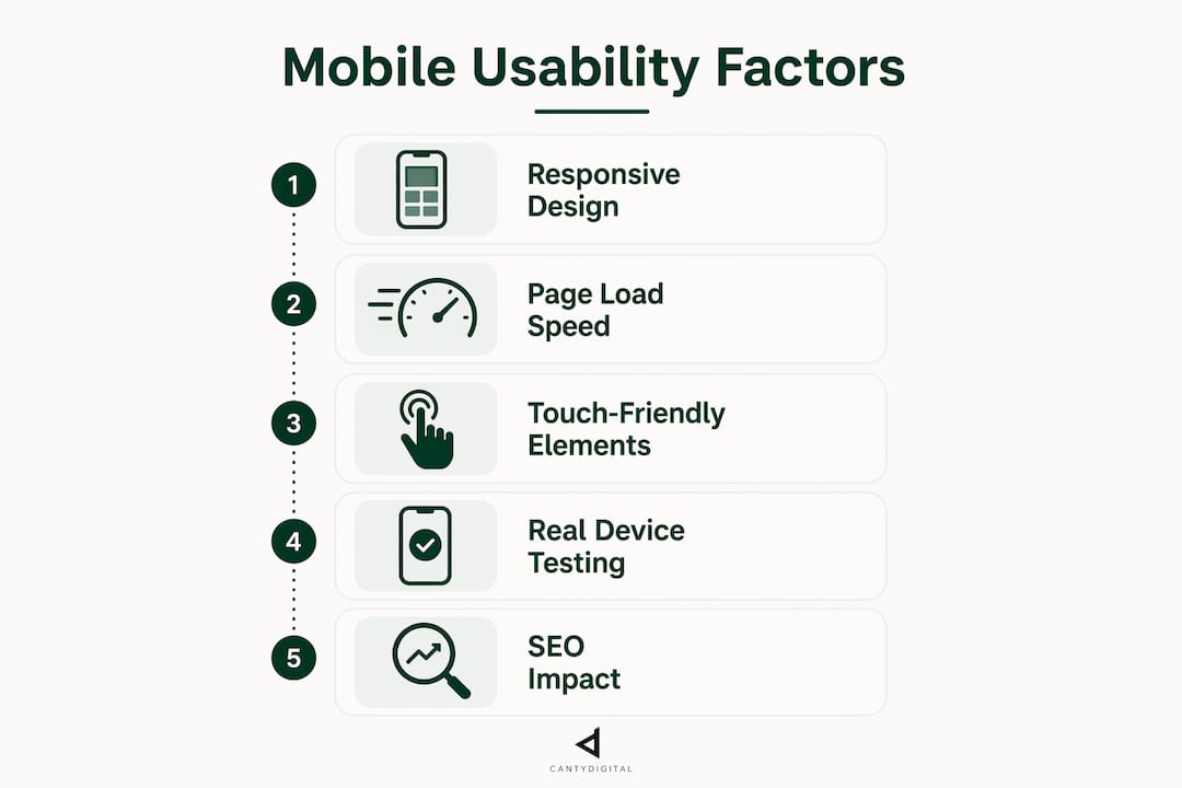
Responsive design is the foundation. Responsive sites use fluid grids, flexible images, and CSS media queries to adapt content across screen sizes. This approach reduces bounce rates by 20–30% compared to fixed-width layouts. A site that reflows correctly on a 375px iPhone screen and a 768px tablet removes the need for horizontal scrolling, which is one of the fastest ways to lose a visitor.
Page load speed is the second pillar. Mobile connections are often slower than fixed broadband, so every kilobyte counts. Slow pages cost real money. Improving page load by one second can increase conversions by 12%. That is not a marginal gain for an ecommerce site turning over six figures annually.
Touch-friendly elements separate a genuinely mobile-optimised site from one that merely displays on a small screen. Mobile UX requires tap targets sized for fingers, not mouse cursors. Buttons and links that are too small or too close together cause mis-taps, frustration, and exits.
Typography and readability matter more on mobile than on desktop. Small screens amplify poor font choices. Body text below 16px forces users to pinch and zoom, which Google treats as a usability failure.
Navigation structure must be simplified for vertical, thumb-driven browsing. Desktop mega-menus collapse into unusable clutter on mobile. A clear hamburger menu, sticky header, or bottom navigation bar keeps users moving through your site.
- Responsive layout using fluid grids and CSS media queries
- Page load speed under three seconds on mobile connections
- Touch targets a minimum of 48×48 pixels with adequate spacing
- Body font size of 16px or larger for comfortable reading
- Simplified navigation built for thumb reach and vertical scrolling
Pro Tip: Test your site on a real device, not just a browser emulator. Emulators miss real-world latency, touch sensitivity, and font rendering that only physical testing reveals.
How does mobile usability affect SEO and business performance?
Mobile usability is a direct Google ranking factor. Sites that fail mobile standards face reduced search visibility across all devices, not just mobile. This is the consequence of mobile-first indexing: your mobile experience determines your position in search results for every user, desktop included.
The business case is equally clear. Mobile bounce rates average 50–60%, compared to 35–45% on desktop. That gap represents visitors who arrived, found the experience difficult, and left before converting. Closing even half that gap through better mobile design produces measurable revenue gains.
Cart abandonment is where poor mobile usability becomes most expensive. 90% of mobile shoppers abandon carts due to checkout friction. Friction means small buttons, confusing form fields, slow page loads, and layouts that break on certain screen sizes. Each of these is a solvable design problem, not an inevitable cost of doing business on mobile.
A well-executed mobile SEO strategy ties these threads together. Better usability reduces bounce rates, which signals to Google that your content satisfies user intent. Higher engagement time and lower exit rates feed back into improved rankings, which drives more qualified traffic. The cycle compounds in your favour when mobile usability is treated as an SEO input, not an afterthought.
What are the most common mobile usability issues?
Most sites carry at least one mobile usability error that harms both user experience and search rankings. Knowing what to look for is the first step to fixing it.
- Text too small to read. Google flags text below 12px as a mobile usability error. Users who cannot read content without zooming leave immediately.
- Clickable elements too close together. Links, buttons, and form fields packed tightly cause accidental taps. The standard minimum spacing between tap targets is 8px, with each target at least 48x48px.
- Content wider than the screen. Fixed-width elements that overflow the viewport force horizontal scrolling. This breaks the reading flow and signals poor technical execution to Google.
- Viewport misconfiguration. A missing or incorrect viewport meta tag causes the browser to render the page at desktop width and scale it down. Viewport misconfiguration is one of the most common technical errors Google identifies in its Search Console mobile usability report.
- Incompatible plugins. Flash and certain legacy plugins do not run on modern mobile browsers. Pages that depend on them display broken content or blank sections.
How to identify these issues
Google Search Console’s Mobile Usability report is the most direct diagnostic tool available. It lists specific errors by URL and shows how many pages are affected. For deeper insight, mobile usability testing involves real users completing tasks on your site, collecting both qualitative feedback and quantitative data like task completion rates and time-on-task. PageSpeed Insights provides performance data alongside Core Web Vitals scores, which Google uses as ranking signals.
Pro Tip: Run Google Search Console’s Mobile Usability report monthly. Issues accumulate quietly after site updates, plugin changes, or CMS upgrades, and catching them early prevents ranking drops before they show up in your traffic data.
What practical strategies improve mobile usability today?
The distinction between a mobile-friendly site and a mobile-optimised site is significant. A mobile-friendly site simply displays correctly on a small screen. A mobile-optimised site is deliberately designed for mobile users, with touch-first interactions, fast load times, and layouts built around how people actually use their phones. Mobile-optimised sites convert better and rank higher.
| Design approach | Mobile-friendly | Mobile-optimised |
|---|---|---|
| Layout | Scales to fit screen | Designed for small screen first |
| Navigation | Desktop menu adapted | Thumb-friendly, simplified structure |
| Touch targets | May be too small | Minimum 48x48px, well spaced |
| Load speed | Variable | Actively managed and tested |
| Conversion focus | Incidental | Built into every interaction |
The practical steps to move from mobile-friendly to mobile-optimised are straightforward.
- Adopt a mobile-first design process. Design for the smallest screen first, then scale up. This forces prioritisation of content and removes clutter that harms mobile UX.
- Compress and serve correctly sized images. Oversized images are the single biggest cause of slow mobile load times. Use modern formats like WebP and serve images at the display size, not larger.
- Set touch targets to a minimum of 48×48 pixels. This applies to buttons, links, form fields, and any interactive element. Add sufficient padding so targets do not crowd each other.
- Use a legible font stack. A minimum 16px body size, with 1.5 line-height, makes text comfortable to read without zooming.
- Simplify your checkout and forms. Reduce the number of fields, use autofill attributes, and make the keyboard type match the input (numeric for phone numbers, email for email fields).
- Test continuously. Mobile usability is not a one-time fix. Every site update is an opportunity to introduce new issues. Build testing into your release process.
For business owners running ecommerce sites, the ecommerce design best practices that reduce cart abandonment overlap almost entirely with mobile usability improvements. Fixing one fixes the other.
Key takeaways
Mobile usability is a direct ranking factor and revenue driver: sites that fail mobile standards lose search visibility and convert fewer visitors than those built with mobile users as the primary audience.
| Point | Details |
|---|---|
| Mobile traffic dominance | 62.45% of global internet traffic is mobile, making mobile usability the priority design decision. |
| Google’s mobile-first indexing | Google ranks all sites based on their mobile version, so poor mobile UX harms desktop rankings too. |
| Speed drives conversions | A one-second improvement in load time increases conversions by 12%, making performance a revenue issue. |
| Common errors are fixable | Viewport misconfiguration, small text, and tight tap targets are the most frequent issues and all have clear technical fixes. |
| Optimised beats friendly | Mobile-optimised sites, designed for touch and speed from the ground up, outperform merely mobile-friendly sites in both rankings and conversions. |
Why mobile usability is the one thing most business owners get wrong
After 12 years working with Australian businesses on web design and SEO, the pattern I see most often is this: a business invests in a new website, it looks great on the designer’s monitor, and nobody tests it seriously on a phone until six months later when the traffic numbers look wrong.
Mobile usability is not a checkbox. It is an ongoing discipline. The sites that perform best in search and convert the most visitors are the ones where someone is actively watching the Mobile Usability report in Search Console, running real-device tests after every significant update, and treating page speed as a business metric rather than a developer concern.
The shift to mobile-first indexing changed the rules permanently. Your desktop site is now secondary in Google’s eyes. That is not a temporary algorithm quirk. It reflects where users actually are. Businesses that accepted this early and rebuilt their sites around mobile users gained ground that is genuinely difficult for slower movers to recover.
The pitfall I see most often with business owners is confusing “it works on my phone” with “it is optimised for mobile.” Those are very different things. A site can display without obvious errors and still have a 60% mobile bounce rate because the buttons are slightly too small, the checkout has one extra step, or the page takes four seconds to load on a 4G connection. Each of those problems has a measurable cost, and none of them are visible to someone casually browsing their own site.
My advice: treat your mobile experience as the primary product. Audit it with the same rigour you would apply to your pricing or your customer service. The returns are direct and measurable.
— Matthew
How CantyDigital helps you get mobile usability right
Mobile usability problems are rarely isolated. They connect to site architecture, page speed, SEO signals, and conversion design all at once.

CantyDigital is a Wollongong-based digital agency with 12 years of experience building high-performance websites and delivering signal-based SEO that works on both traditional search engines and AI platforms. If your site has mobile usability issues affecting your rankings or conversions, the SEO tips for beginners on the CantyDigital site are a strong starting point. For businesses ready for ongoing support, the monthly SEO growth plans include mobile optimisation as a core component, with no lock-in contracts and measurable outcomes from month one.
FAQ
What is mobile usability in simple terms?
Mobile usability measures how easily a person can use a website or app on a smartphone or tablet. A site with good mobile usability loads quickly, displays correctly, and responds accurately to touch.
Why is mobile usability important for SEO?
Google uses mobile-first indexing, meaning it ranks your site based on its mobile version. Poor mobile usability leads directly to lower search rankings, even for desktop users searching your content.
What are the most common mobile usability errors?
The most frequent errors are text too small to read, clickable elements placed too close together, content wider than the screen, and viewport misconfiguration. Google Search Console’s Mobile Usability report identifies these by URL.
How do I test my site’s mobile usability?
Use Google Search Console’s Mobile Usability report for technical errors, PageSpeed Insights for load performance, and real-device testing with actual users to find friction points that automated tools miss.
What is the difference between mobile-friendly and mobile-optimised?
A mobile-friendly site displays correctly on small screens. A mobile-optimised site is designed specifically for mobile users, with touch-first interactions, fast load times, and layouts that drive conversions on phones and tablets.


