

Responsive web design is defined as an approach to building web pages that automatically adapt their layout, images, and content to fit any screen size or device. Coined by Ethan Marcotte in 2010, the technique rests on three foundational pillars: fluid grids using relative units, flexible images with max-width constraints, and CSS media queries for conditional styling. Responsive design is an approach, not a single technology. It encompasses multiple CSS and HTML techniques working together to make layouts flexible and adaptive across smartphones, tablets, laptops, and desktops.
What is responsive web design and how has it evolved?
The original responsive design definition centred on three pillars, each solving a specific problem with fixed-width layouts. Fluid grids replace pixel-based column widths with percentage-based units, so a three-column layout shrinks proportionally on a narrow screen rather than overflowing. Flexible images use max-width: 100% to prevent images from exceeding their containers. CSS media queries apply different style rules based on viewport width, height, or orientation.

These three pillars solved the immediate problem of desktop sites breaking on early smartphones. They did not, however, anticipate the explosion of device sizes that followed, from smartwatches to ultra-wide monitors.
Modern CSS tools that extend the original model
Modern responsive design incorporates CSS Grid features including minmax and auto-fit, fluid typography with clamp(), and container queries that respond to parent container size rather than the viewport. Each of these tools addresses a gap the original three pillars left open. CSS Grid with auto-fit and minmax creates layouts that self-organise based on available space, reducing the need for fixed breakpoints. clamp() lets font sizes scale smoothly between a minimum and maximum value without a single media query.
Container queries are the most significant shift in responsive thinking since Marcotte’s original article. Media queries handle major viewport changes, whereas container queries enable responsive behaviour at the component level, improving modularity and reuse. A card component can now respond to the width of its parent column rather than the width of the browser window. This distinction matters enormously in component-based frameworks where the same card might appear in a narrow sidebar or a wide content area.
| Technique | Responds to | Best used for |
|---|---|---|
| CSS media queries | Viewport width | Page-level layout changes |
| Container queries | Parent container width | Component-level responsiveness |
| CSS Grid with auto-fit | Available space | Self-organising column layouts |
clamp() typography |
Viewport width | Fluid font scaling without breakpoints |
Pro Tip: Use container queries for reusable UI components like cards, sidebars, and navigation modules. Reserve media queries for top-level layout decisions. Mixing both gives you layered responsiveness that holds up across any device combination.
How does responsive design impact user experience and business outcomes?
Responsive websites improve accessibility and navigation, helping users find information quickly and stay longer on the site. The usability gains are direct: touch targets are appropriately sized, text is legible without zooming, and navigation adapts to thumb-friendly patterns on small screens. These are not cosmetic improvements. They determine whether a visitor stays or leaves within seconds.
The business case is equally direct. Failing to implement responsive design can cause businesses to lose up to 90% of potential customers, and 52% of users report lower engagement when mobile experience is poor. That figure represents a significant portion of any site’s audience walking away before converting. No amount of paid traffic recovers a loss at that scale.
Responsive design also supports consistent digital branding. When a user moves from a desktop session to a mobile device, the visual language, typography, and interaction patterns remain coherent. That consistency builds trust and reduces cognitive load. A disjointed experience between devices signals to users that a brand has not invested in their experience.
The resource argument is compelling for development teams. Responsive design saves development time by maintaining a single, unified codebase instead of separate desktop and mobile sites. One codebase means one set of updates, one QA process, and one deployment pipeline. For agencies and in-house teams managing dozens of pages, that efficiency compounds quickly.
- Usability: Touch targets, legible text, and adapted navigation reduce friction on every device.
- Engagement: Poor mobile experience drives away more than half of users before they interact with content.
- Branding: Consistent visual identity across devices builds user trust and recognition.
- Development efficiency: A single codebase cuts update time, testing overhead, and deployment complexity.
- SEO performance: Google’s mobile-first indexing means responsive sites receive preferential treatment in mobile search rankings.
What are best practices for implementing responsive web design today?
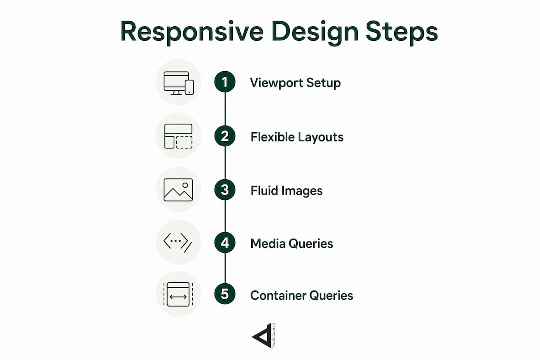
Mobile-first design is the recommended starting point. You write base styles for the smallest screen, then layer enhancements for larger viewports using min-width media queries. This approach forces you to prioritise content and functionality rather than stripping features down after the fact. The result is leaner CSS and a clearer hierarchy of what actually matters on the page.
1. Set the viewport meta tag correctly
The viewport meta tag is critical for preventing mobile devices from rendering pages at desktop widths. Without it, a browser renders the page at 980px and scales it down, making text unreadable and media queries irrelevant. The correct tag is <meta name="viewport" content="width=device-width, initial-scale=1">. This single line of HTML is the prerequisite for every other responsive technique to function correctly.
2. Use flexible layout systems
CSS Grid and Flexbox replace float-based layouts with systems that adapt naturally to available space. Fluid layouts continuously adapt to any screen size, in contrast to adaptive design’s fixed breakpoints, making responsive design more flexible across wide device ranges. Use Grid for two-dimensional page structure and Flexbox for one-dimensional component alignment. Combine them rather than choosing one exclusively.
3. Apply fluid images and typography
Set images to max-width: 100% and height: auto as a baseline. For art-directed images that need different crops at different sizes, use the <picture> element with srcset and sizes attributes. For typography, clamp(1rem, 2.5vw, 1.5rem) scales body text between a minimum and maximum size without a single breakpoint.
4. Layer media queries and container queries
Use media queries to control the overall page grid and major layout shifts. Use container queries to make individual components context-aware. This layered approach means a sidebar widget behaves correctly whether it sits in a 300px column or a 600px panel, without writing duplicate CSS.
5. Test across real devices and resolutions
Browser developer tools provide a starting point, but they do not replicate real device rendering accurately. Test on physical devices at key screen widths. Pay particular attention to the 320px–375px range, which covers the smallest common smartphones, and the 768px range, which covers tablets in portrait orientation.
Pro Tip: Avoid defining breakpoints at arbitrary pixel values like 768px or 1024px. Instead, add a breakpoint where your content breaks. Open the browser, resize the window slowly, and add a media query at the point where the layout starts to look wrong. Content-driven breakpoints produce more resilient designs than device-driven ones.
Common pitfalls to avoid include relying on fixed pixel widths for any container, neglecting to test with real content rather than placeholder text, and forgetting to adapt interactive elements like forms and navigation menus for touch input.
What tools and resources help developers master responsive design?
The core CSS features every developer needs are media queries, container queries, CSS Grid, Flexbox, and clamp() for fluid typography. These are native browser capabilities with strong support across all modern browsers. No third-party dependency is required to build a fully responsive layout.
- Mozilla Developer Network (MDN): The authoritative reference for CSS Grid, Flexbox, container queries, and media query syntax. MDN’s interactive examples let you modify code and see results immediately.
- Browser developer tools: Chrome DevTools and Firefox Developer Tools both include a responsive design mode that simulates device widths. The Firefox Grid Inspector visualises grid tracks and gaps in real time.
- CSS-Tricks and Smashing Magazine: Both publish in-depth articles on emerging CSS features, including container queries and intrinsic layout techniques. Smashing Magazine’s articles are peer-reviewed by practising developers.
- Responsive design frameworks: General-purpose CSS frameworks provide pre-built grid systems and utility classes that implement responsive patterns. They are useful for rapid prototyping but should not replace understanding the underlying CSS.
- Can I Use (caniuse.com): Tracks browser support for every CSS feature. Check container query support before shipping to production, particularly for older browser targets.
Staying current with CSS standards means following the CSS Working Group’s GitHub repository and the W3C specifications. New features like the @layer cascade rule and has() selector interact with responsive patterns in ways that are worth understanding early. The relationship between web design and SEO also evolves alongside CSS capabilities, so tracking both simultaneously pays dividends.
Key takeaways
Responsive web design is the single most effective method for delivering consistent, accessible user experiences across every device, and it starts with fluid grids, flexible images, and CSS media queries.
| Point | Details |
|---|---|
| Three foundational pillars | Fluid grids, flexible images, and CSS media queries form the basis of every responsive layout. |
| Container queries change the game | Components can now respond to their parent container, not just the viewport, enabling true modularity. |
| Mobile-first is non-negotiable | Write base styles for the smallest screen first, then layer enhancements for larger viewports. |
| Business impact is measurable | Poor mobile experience can cost businesses up to 90% of potential customers. |
| One codebase saves resources | A single responsive site eliminates the overhead of maintaining separate desktop and mobile versions. |
Why I think most developers are still thinking about responsive design the wrong way
The industry spent years treating responsive design as a checkbox. Add a viewport meta tag, write three media queries at 768px and 1024px, and call it done. That approach worked when device diversity was limited. It does not work now.
The shift I find most significant is the move from viewport-centric thinking to content-centric thinking. Container queries make this concrete. When a component responds to its container rather than the browser window, you stop designing for devices and start designing for content relationships. A card does not need to know it is on a phone. It needs to know how much space it has. That is a fundamentally different mental model, and it produces more reusable, maintainable code.
The evolution from simple media queries to intrinsic design pushes designers toward content-first layouts that adapt naturally rather than forcing designs into preset screen sizes. I have seen this play out on projects where switching from fixed breakpoints to CSS Grid with auto-fit and minmax eliminated entire blocks of media query CSS. The layout just worked. That is not magic. It is the browser doing what it was designed to do when you give it the right instructions.
The business value of getting this right compounds over time. A site built on intrinsic layout principles requires fewer emergency fixes when a new device category appears. It is easier to hand off to another developer. It performs better because it ships less CSS. Investing the time to understand container queries and clamp() now pays back every time you build something new.
— Matthew
CantyDigital builds responsive sites that perform across every device
If you are building or rebuilding a site and want it to perform consistently across every screen size, CantyDigital’s web design and SEO services are built for exactly that outcome.
CantyDigital is a Wollongong-based digital agency with 12 years of experience building high-performance websites from the ground up with SEO and device compatibility at the core. Every site we build follows mobile-first principles, uses modern CSS layout systems, and is tested across real devices before launch. Our SEO services are structured to complement responsive design, so your site ranks well and converts across all platforms. If you have questions about your current site’s performance, our website design FAQs are a practical starting point.
FAQ
What is responsive web design in simple terms?
Responsive web design is an approach where a single website automatically adjusts its layout and content to fit any screen size, from a small smartphone to a large desktop monitor.
What are the three core principles of responsive design?
The three core principles are fluid grids using relative units, flexible images with max-width constraints, and CSS media queries for conditional styling, as defined by Ethan Marcotte in 2010.
What is the difference between responsive and adaptive design?
Responsive design uses fluid layouts that continuously adapt to any screen size. Adaptive design uses fixed layouts that snap to predefined breakpoints, making it less flexible across the full range of modern devices.
Why is the viewport meta tag important for responsive design?
The viewport meta tag prevents mobile browsers from rendering pages at desktop widths. Without it, media queries do not trigger correctly and text becomes unreadable on small screens.
What is a container query and how does it differ from a media query?
A container query makes a component respond to the size of its parent container rather than the browser viewport. Media queries control page-level layout changes, while container queries enable component-level responsiveness.